When you picture a Thanksgiving feast, you will most likely think about home-cooked dishes and that is only normal since most people prefer to dine in their respective homes.…
continue reading
Rating :
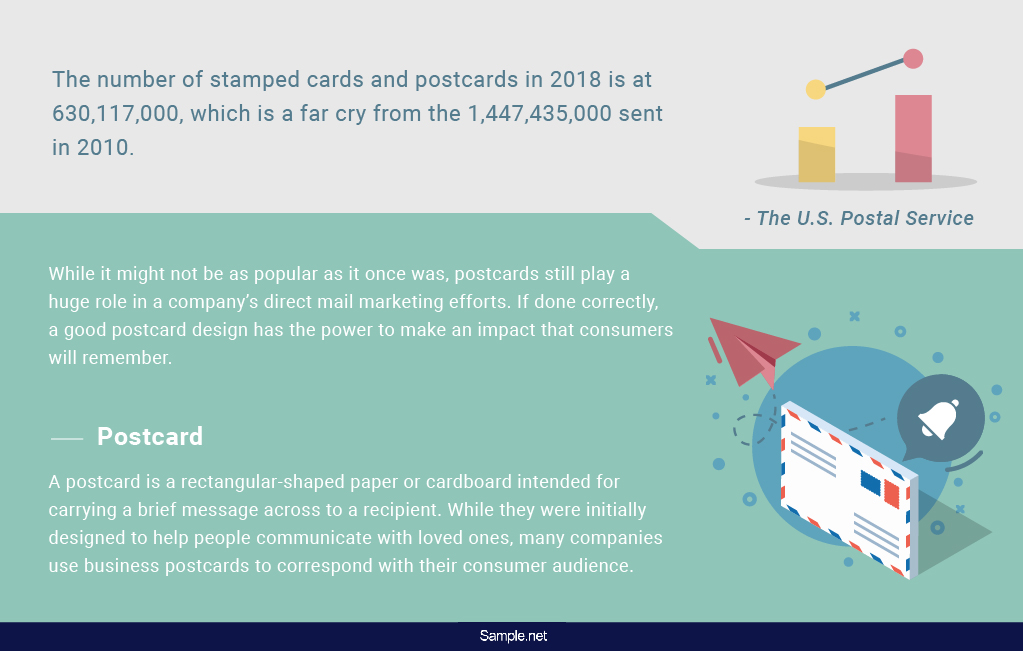
There’s something about opening your mailbox to find a postcard on top of a pile of letters. But digital communication has made print mail seem like an ancient pastime, which is something that we can all expect due to its convenience. The U.S. Postal Service reports the number of stamped cards and postcards in 2018 at 630,117,000, which is a far cry from the 1,447,435,000 sent in 2010. While it might not be as popular as it once was, postcards still play a huge role in a company’s direct mail marketing efforts. If done correctly, a good postcard design has the power to make an impact that consumers will remember.
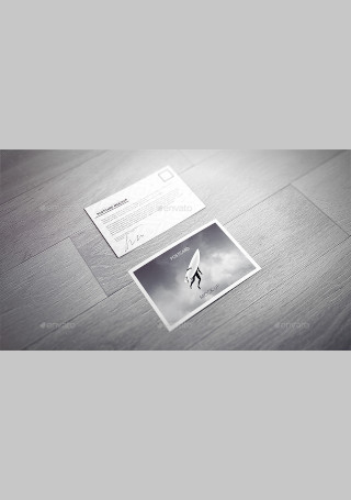


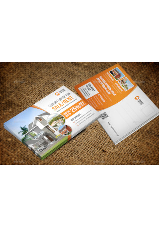
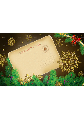
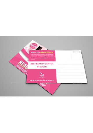
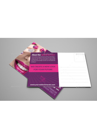
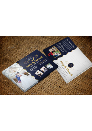
A postcard is a rectangular-shaped paper or cardboard intended for carrying a brief message across to a recipient. It can act as an alternative or can complement other marketing instruments such as modern flyers, catalogs, and magazines. While they were initially designed to help people communicate with loved ones, many companies use business postcards to correspond with their consumer audience. It’s an affordable medium of communication for businesses that aim to deliver their marketing message in the quickest way possible. Unlike email marketing, direct mail marketing in the form of postcards can last a lifetime. In fact, Small Business Trends found that about 56% of customers consider print marketing to be the most trustworthy type of marketing. This has a lot to do with the idea that anything on print took time, research, and other resources to create. It shows that you care about delivering something worthwhile to your recipient, especially when the effort you put into it is evident in its content.
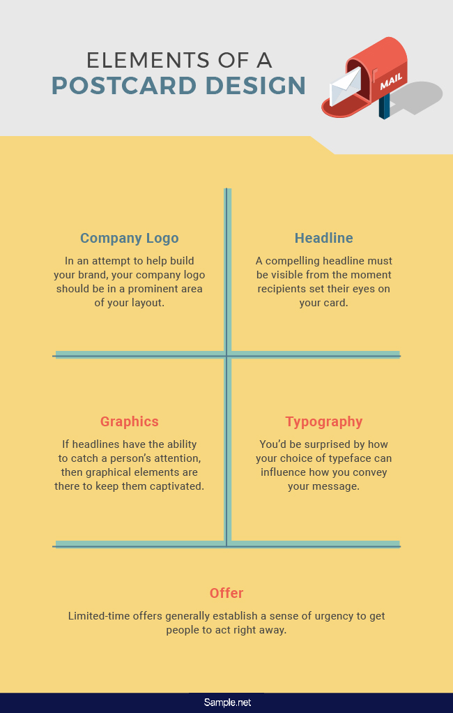
While there isn’t an official rule as to how you should design a postcard, there’s a formula that could lead you toward a successful direct marketing campaign using the right combination of elements. The popularity of postcards come with the belief that direct mail marketing continues to be a professional yet friendly approach for reinforcing your message. But “winging it” isn’t the best strategy to enter the scene with, so you must be mindful of what works and what doesn’t. Listed below are the elements to focus on for effective postcard design.
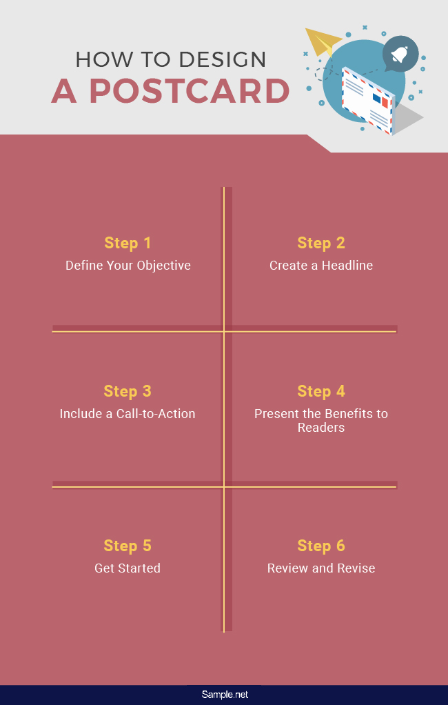
Postcard marketing isn’t new to the game. If you haven’t thought about using a postcard to deliver your marketing message before, perhaps you haven’t considered all the benefits it may bring you. The secret to running an effective direct mail marketing campaign is to design a postcard that speaks volumes to your target audience. Easier said than done, right? There are multiple ways to start a postcard campaign that consumers will follow, so here’s a quick guide to help keep you in line with this goal.
Brainstorming your ideas beforehand can help you create a strong foundation for your postcard. The first thing you can do is define the purpose of the medium and what you want to achieve throughout the campaign. This will help you understand what goes into the card and keep you on track as you go through the different stages of the design process. It’s easy to stray away from the bigger picture when you aren’t objective-oriented; thus, see to it that your decisions take your end goal into account.
We won’t lie; it can be challenging to make a headline that’s enough to grab a person’s attention. It’s one of the most critical elements of your postcard that can make or break the entire campaign. Your headline is the first thing a person sees when they lay their eyes on your postcard. If it doesn’t encourage further reading, don’t expect it to garner a positive response from your audience. It should be thought-provoking in order to pique one’s interest and get them hooked. The best you could do is to make a headline that focuses on providing a solution to a common problem experienced by your target audience.
An essential part of your postcard is the call-to-action. You can do everything to make a consumer want to buy your product, but without a strong call-to-action, all your efforts would lead you to a dead end. You need to let people know how they can respond to your message by giving them valuable information on what to do next. This must be conveyed clearly in proper wording to make it easy for readers to find out what action to take. Be sure to make this a priority when deciding how you can translate your objectives into texts and visuals.
Other businesses in the market may offer the same type of products and services as you do. It’s easy to present what you have to offer to consumers, but it’s hard to convince them to choose you as a credible solution. You can try giving them incentives to draw their attention and guarantee quality offers. The key is to make your audience feel comfortable about the idea of committing to what you’re selling despite the odds that scare them.
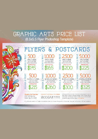
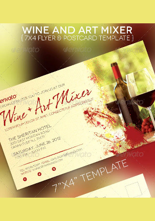
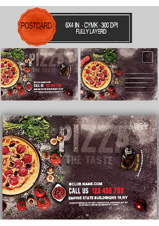
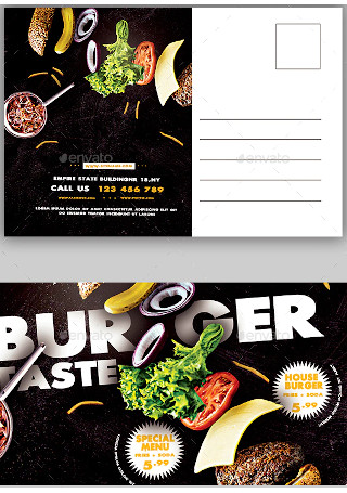
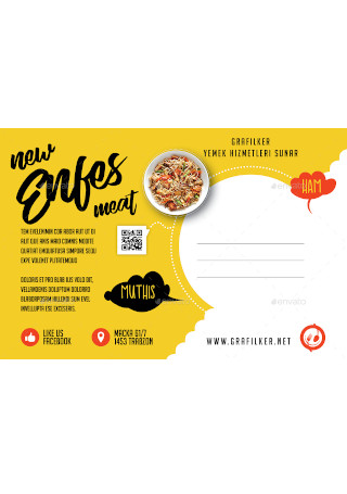
Now that you have your battle plan ready, now is the time to get to work. There are many ways to begin the design process, depending on your skills and preference. These days, even the most experienced advertisers opt to use a postcard template as a way of keeping their postcard designs consistent with one another. It’s also an efficient way to produce a postcard that meets printing standards thanks to its pre-designed features. All that there is left to do is to customize the text and graphic contents of the card to satisfy your business objectives.
After hours of editing your layout, take the time to step back and see what you’ve accomplished so far. It’s easy to get caught up in the moment and miss bits of information that are crucial to your marketing goal. Even if you are in a hurry to get it done, it’s always a wise idea to spare a few minutes for the revision stage of the process. Once it passes the final inspection, your postcard is ready for delivery!
As an advertiser, you might have a ton of questions about postcard design. While its return rates make it an excellent investment for all business types, there are several issues that people face when it comes to creating effective postcards. To help you with your direct mail campaign, keep the following points in mind:
1. Do show the purpose of the postcard.
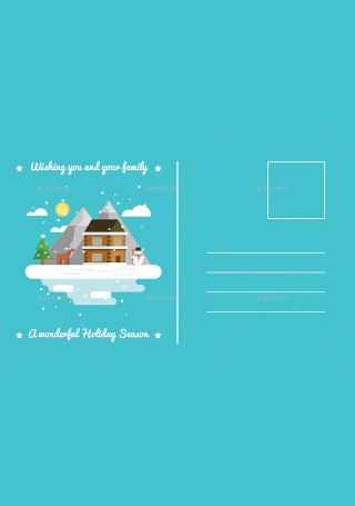
How do you want people to respond to your postcard? No business writes a card to their customers just to say hello. It’s usually meant to promote an offer, announce an event, or advertise a new product or service. The purpose of the card must be made evident through its contents so recipients may grasp its message immediately.
2. Do keep your audience in mind.
Always tailor the text and creatives in your content toward your target audience. There’s no point in creating a postcard that the people you are designing for can’t relate to. A design that appeals to you might not deliver the same effect to your audience. Thus, focus on the type of content that would matter to your target readers. Disregarding the desires of your recipients will likely lead to a poor response rate to your advertising efforts.
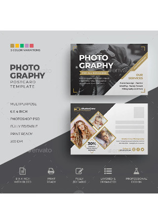
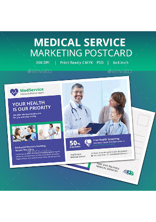
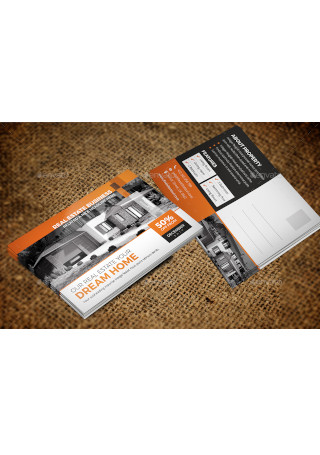
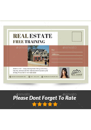
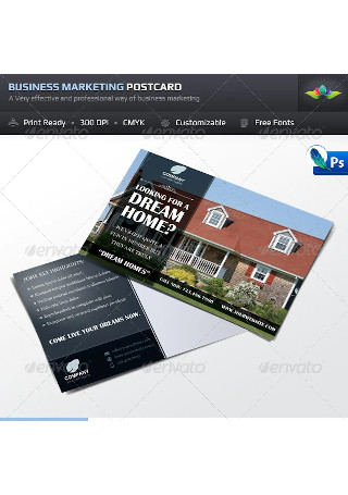
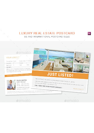
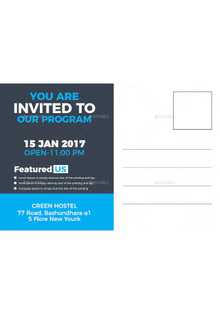
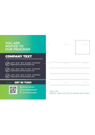
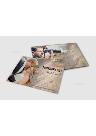
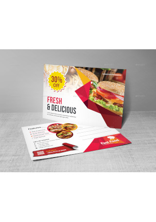
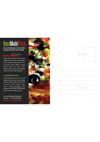
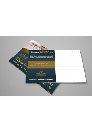
3. Do use eye-catching images.
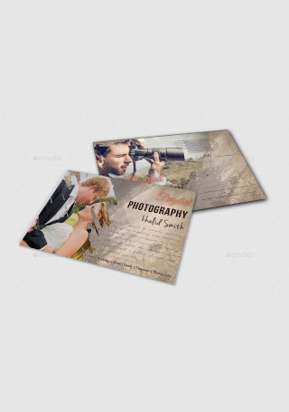
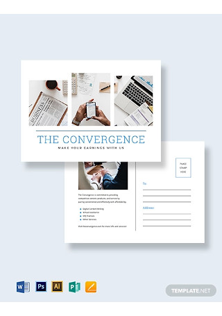
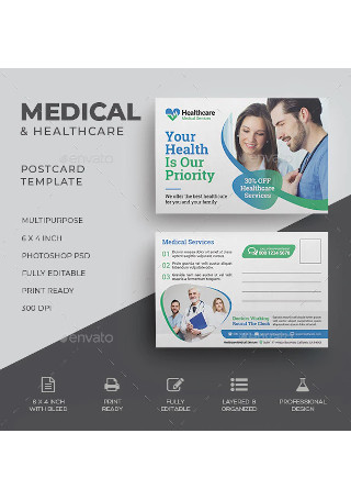
Choose an image that best reflects your business and its niche. Anything captivating and relevant to what your business does can be a good addition to the postcard for branding reasons. It’s about creating a visual that would stick to a person’s mind and remind them of you. Using one image as your main visual is highly recommended to keep your audience focused on the main idea. You’ll also want to be careful about using images that are copyrighted. Not giving credit where credit is due can get you in trouble with its rightful owner. You can also ask permission from the person before using the image to avoid the little watermarks and spare you from copyright infringement.
4. Do use color variations for a creative touch.
Colors help attract attention by leading the eyes to where you want them to go. When applied correctly, color variations have the ability to emphasize points that matter to readers. The key is to use colors that complement one another to avoid distracting readers with visual ideas that clash. Try not to overdo your color fest as you wouldn’t want to make it difficult for your audience to grasp the contents of your postcard properly. It’s best to choose colors that are friendly to the eyes as well, so as not to drive one’s attention away from what’s being shown on your layout.
5. Do use humor where appropriate.
Humor adds personality to your postcard by making it easier for readers to connect with your message. It’s also an exciting way to relate with your recipients on a more personal level. But jokes are only fun as long as people can get what they mean quickly. There’s also a fine line between humorous and offensive—it’s also a line you want to be very careful with. Some jokes may not resonate well with your type of audience, so be sure to steer clear of controversial topics that could put you under much scrutiny.
1. Don’t make it too big.
While you’re free to choose the size of your postcard, you don’t want to go overboard with your options. The maximum dimensions of a postcard are 235 mm length x 125 mm width x 5 mm height. It’s a relatively good size for something that’s meant to be delivered and carried out conveniently. If you’re thinking about going for a larger size to let it carry more information, you might want to rethink your strategy. It’s a lot easier for people to store and display a postcard that’s the size of a notebook than a laptop screen.
2. Don’t put too much in your content.
Too much text and design is never a good idea. It could stir readers away from the point you are trying to convey and lead them to an end that bears no significance to your objective. It’s a good idea to start with a draft of your layout to find out what works and what doesn’t. See what elements the postcard can do without and remove them from your content. Proper spacing is also necessary to prevent a cluttered outcome. Once you’re satisfied with what’s left, you can arrange the contents of your layout to achieve a clean, organized, and engaging appearance.
3. Don’t go crazy with fonts.
Avoid using more than two fonts in the postcard. Incorporating different font styles into your postcard can make it appear messy and unprofessional. It can also make your text a bit too difficult for people to read, especially when it’s a poorly chosen font. You only have a few seconds to catch someone’s eye and make a lasting impact, so avoid wasting those precious seconds on a material that forces a reader to try to figure out what the text in your postcard says. Keep in mind that readability makes all the difference between a dull and engaging content. You might want to go with something that is simple and appropriate to the card’s tone.
4. Don’t put unnecessary information on the card.
Putting unnecessary information in your content is a waste of time and space. Fax numbers and pager details are no longer a thing in today’s age, which is why your audience won’t find it useful anymore. Flooding your content with wordy text will only make your postcard confusing to readers. Anything that requires a detailed content belongs to a business flyer or an advertising brochure. Utilize the limited space wisely by keeping information brief and to the point. Using simple language is another way to avoid overwhelming your recipients. A short, crisp headline would do well, along with some essential information that supports your main message.
5. Don’t settle with a regular printer for the job.
Postcard printing is not something to take lightly, as high-quality prints are always a plus. Remember that postcards are a tangible material that people can hold as part of the overall experience. If the appearance and texture of your postcard fail to make the difference you need to communicate your message, then it’s back to the old drawing board for you. Print marketing can be a bit pricey because of how it requires you to make a good investment for favorable results. Fortunately, most printing firms offer significant discounts for bulk orders, so you can partner with a company that creates excellent-quality postcards at a reasonable price. This will help you produce postcards that are not only impactful but durable as well.
Sending postcards is fun and easy. But when it’s for a marketing reason, you need to make sure you aren’t wasting your time on a card that fails to generate the desired response from your audience. Postcard advertising is not going to fade away from the spotlight anytime soon, so be sure to provide your audience with something they can latch onto for the success of your campaign.

When you picture a Thanksgiving feast, you will most likely think about home-cooked dishes and that is only normal since most people prefer to dine in their respective homes.…
continue reading
Before the explosion of movie trailers and teaser campaigns, movie posters were the main attraction before the real deal—the movie—reached the big screen. Apart from being a promotional material,…
continue reading