8+ Sample Heuristic Analysis
-
Heuristic Analysis Template
download now -
Medical Device Heuristic Analysis
download now -
Heuristic Analysis in PDF
download now -
Heuristic Inquiry Analysis
download now -
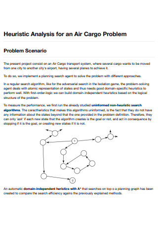
Heuristic Analysis for an Air Cargo Problem
download now -
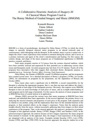
Collaborative Heuristic Analysis
download now -
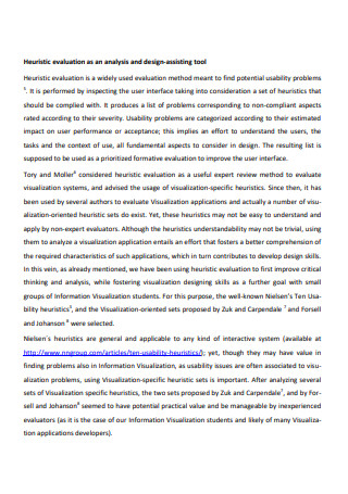
Heuristic Evaluation Analysis
download now -
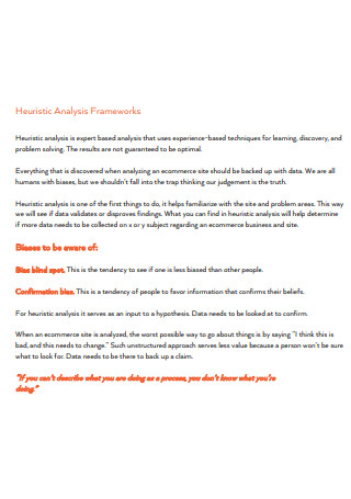
Heuristic Analysis Framework
download now -
Heuristic Analysis in DOC
download now
FREE Heuristic Analysis s to Download
8+ Sample Heuristic Analysis
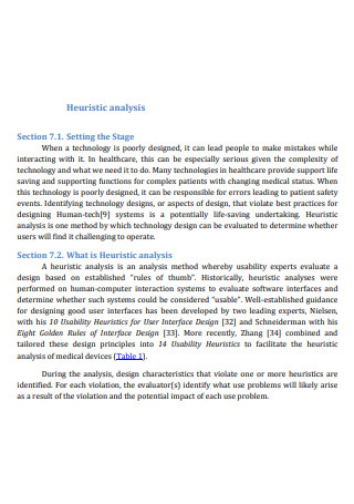
What Is a Heuristic Analysis?
Techniques of Heuristic Analysis
Advantages of Heuristic Analysis
Disadvantages of Heuristic Analysis
The Usability Heuristics for User Interface Design
How to Run a Heuristic Analysis
FAQs
When should a heuristic analysis be performed?
Is heuristic analysis worth it?
Why should a heuristic analysis be performed?
What Is a Heuristic Analysis?
By definition, a Heuristic analysis is a technique for detecting viruses that involve inspecting code for suspicious properties. The heuristic analysis looks for commands or instructions that would not normally be found in an application. As the technological world evolves, cybercriminals develop new threats that can pose a huge risk to cybersecurity, and heuristic analysis is one of the only methods used to deal with the massive volume of these new threats seen on a daily basis. The heuristic model of analysis was created specifically to detect suspicious characteristics in the unknown, new viruses, modified versions of existing threats, and known malware samples.
Heuristic analysis is also a method of discovery, learning, and problem-solving that employs rules, estimates, or educated guesses to arrive at a satisfactory solution to a specific issue. While this method of problem-solving is not perfect, it can be extremely effective when applied to computer processes that require a quick answer or timely alert based on intuitive judgment.
Techniques of Heuristic Analysis
To work properly, heuristic analysis can use different techniques. Here are those:
- Static Heuristic Analysis – this technique of heuristic analysis entails decompiling and inspecting the source code of a suspect program. This code is then compared to previously known viruses in the heuristic database. If a certain percentage of the source code matches anything in the heuristic database, the code is marked as potentially dangerous.
- Dynamic Heuristics – this technique works by isolating the suspicious program or piece of code within a specialized virtual machine, known as a sandbox, and allows the antivirus program to test the code and simulate what would happen if the suspicious file was allowed to run. It examines each command as it is executed, looking for any suspicious behaviors such as self-replication, overwriting files, and other virus-like actions.
Advantages of Heuristic Analysis
Here are the advantages that an effective heuristic analysis can bring:
- It identifies numerous usability issues and significantly improves the user experience of a particular product or application.
- It is usually less expensive and faster than full-fledged usability tests, which necessitate participant recruitment, coordination, equipment, running the test, recording, analyzing, and so on.
- Heuristics can provide assistance to the evaluators whenever they focus on specific problems (i.e., lack of system feedback, poor discoverability, error prevention, etc.)
- Heuristics generally do not contain the ethical and practical issues/problems that inspection methods involving actual users do.
- Design evaluation using a set of heuristics can assist in identifying usability issues with specific user flows and determining the impact on the overall user experience.
Disadvantages of Heuristic Analysis
Resorting to Heuristic Analysis can also lead to many disadvantages, which are the following:
- In resorting to heuristic analysis. experienced usability experts are often difficult to find and can be costly.
- The value of issues discovered by the evaluators is only limited by their level of expertise.
- A heuristic analysis may occasionally raise false alarms: issues that, if left alone, would not necessarily have a negative impact on the overall user experience are sometimes flagged to be fixed.
- Heuristic analysis, unlike cognitive walkthroughs, is based on preconceived notions of what constitutes “good” usability.
- If the evaluators are not members of the design or development teams of particular software, they may be unaware of any technical constraints on the design.
The Usability Heuristics for User Interface Design
Here are the usability heuristics for user interface design, developed by Jakob Nielsen; They are so-called because they only serve as broad rules of thumb and not specific usability guidelines.
How to Run a Heuristic Analysis
Here are the steps that you can take to ensure that the heuristic analysis runs efficiently:
-
1. Define the Scope
Budgets May Be Limited on both large and small projects. This is especially true for large eCommerce sites: for example, it may not be feasible to examine the entire site because it would take too long and thus become too expensive.
This is where the scoping of the heuristic analysis comes into play. Parameters can be set to look only at the most important parts of the site. Because of the limited scope, it may only be possible to focus on specific user flows and functionalities, such as login/register, search and browse, product detail pages, shopping cart, and checkout.
-
2. Familiarize the Business Requirements and the Users
The first thing in familiarization is that the evaluators must comprehend the product/business system’s requirements. The next thing, as with any typical user-centered design process, knowing the users is critical. Specific user personas must be created in order to facilitate heuristic analysis. Determine whether the end-users are experts or novices by identifying the user demographics.
-
3. Decide on which Reporting Tools to Use
It is critical to decide which set of heuristics the evaluators will employ. A chosen set of heuristics will provide common guidelines against which each expert can evaluate and ensure that they are all on the same page. Without it, the heuristic analysis process could devolve into complete chaos, producing inconsistent, Contradictory Reports and eventually becoming ineffective.
As a rule of thumb, a system, a format, and which tools to use should all be agreed upon as part of the heuristic evaluation plan. It should be a universal tool to which everyone has easy access.
-
4. Evaluate the Experience and Identify Issues
It is critical to decide which set of heuristics the evaluators will employ. A chosen set of heuristics will provide common guidelines against which each expert can evaluate and ensure that they are all on the same page. Without it, the heuristic analysis process could devolve into complete chaos, producing inconsistent, Contradictory Reports and eventually becoming ineffective. As a rule of thumb, a system, a format, and which tools to use should all be agreed upon as part of the heuristic evaluation plan. It should be a universal tool to which everyone has easy access.
-
5. Analyze and Present the Results
Following the completion of a heuristic analysis, the evaluation manager (or observer) performs some housekeeping and organization, such as removing duplicates and compiling the findings. The observer’s next step is to compile the heuristic evaluation reports and create a table with the severity ratings of usability issues that the design team can prioritize.
FAQs
When should a heuristic analysis be performed?
Heuristic analysis can be carried out at any point in the design process. However, it would not be productive to do it too early. A heuristic analysis is typically performed later in the design phase, after wireframing and prototyping but before visual design and UI development. If you wait too long, making changes will be costly. Existing products with poor usability are frequently subjected to a heuristic analysis before a redesign begins.
Is heuristic analysis worth it?
While heuristic analysis and detection processes are not perfect and may occasionally produce false positives, this method of proactive virus scanning can be a very effective way to supplement traditional signature scanning solutions. Antivirus software that uses heuristic analysis is constantly being improved, ensuring that processes run more efficiently and make better use of computer resources. Heuristic antivirus analysis is unquestionably a worthwhile investment for organizations seeking maximum protection from known and unknown malware and viruses.
Why should a heuristic analysis be performed?
The primary reason for conducting a heuristic analysis is to enhance the usability of a digital product. Another reason is cost-effectiveness. In this context, it refers to the speed with which a product can be used as a direct result of improved usability. Learnability, discoverability, memorability, flexibility, user satisfaction, and error handling are all examples of usability quality components. When these components are of high quality, the UX of a product improves significantly.
A Heuristic analysis serves as a helpful method that helps in analyzing a website or an application that is in its development stage through the means of a structured and widely accepted framework. It should be noted, however, that a heuristic analysis should only be used when objectivity is needed and the overall aim is to analyze a product’s usability through metrics that are less subjective and more universally acceptable. It can also be used on apps that suffer from many usability issues in order to have dramatic improvements. In this article, you can download different examples of a heuristic analysis so that you have something to use as a guide on how to conduct one.