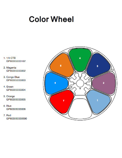
Color Wheel Names Chart
-
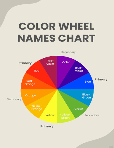
Color Wheel Names Chart
download now -
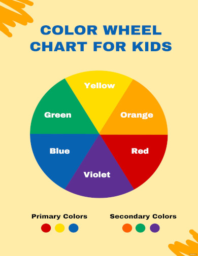
Color Wheel Chart for Kids
download now -

Vintage Color Wheel Scale Chart
download now -
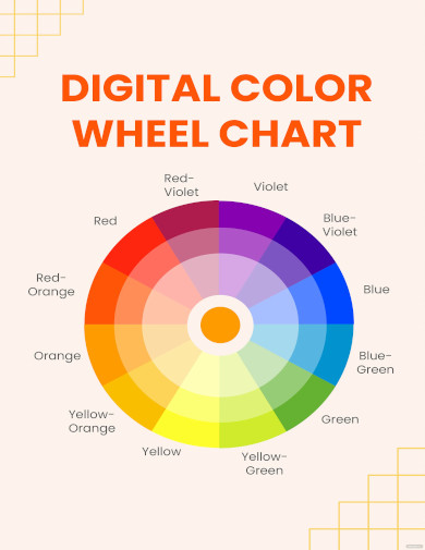
Digital Color Wheel Chart
download now -
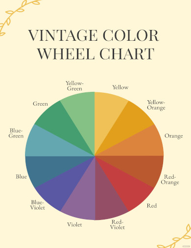
Vintage Color Wheel Chart
download now -
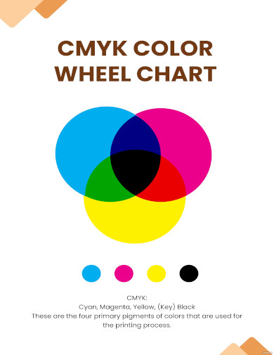
CMYK Color Wheel Chart
download now -
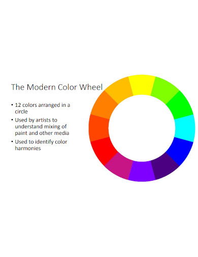
Modern Color Wheel
download now -
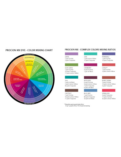
Color Mixing Wheel Chart
download now -
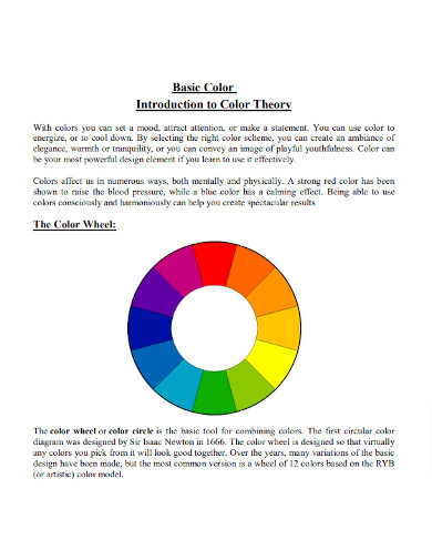
Basic Color Wheel
download now -
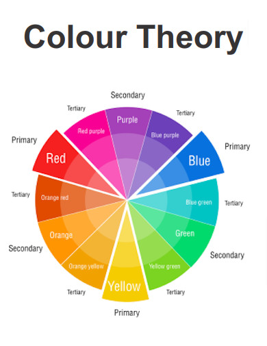
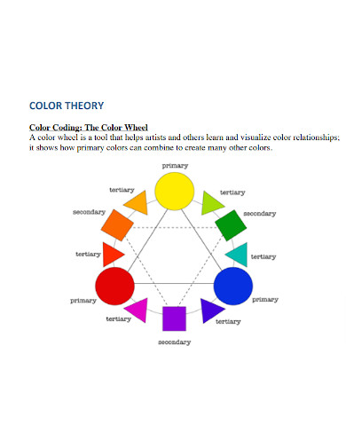
Colour Wheel Theory
download now -
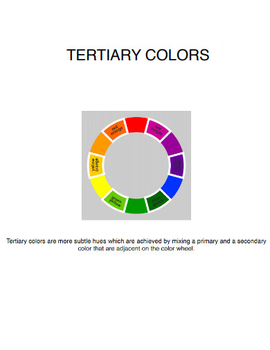
Tertiary Color Wheel
download now -
Colour Wheel Chart
download now -
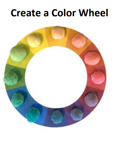
Color Wheel Activity
download now -
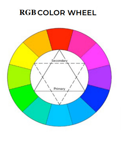
RGB Color Wheel
download now -
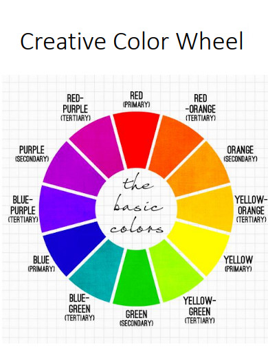
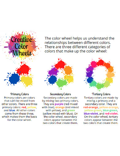
Creative Color Wheel
download now -
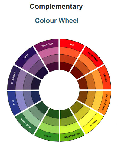
Complementary Colour Wheel
download now -
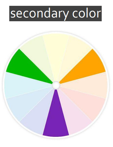
Secondary Color Wheel
download now -
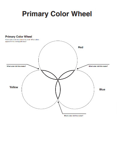
Primary Color Wheel
download now -
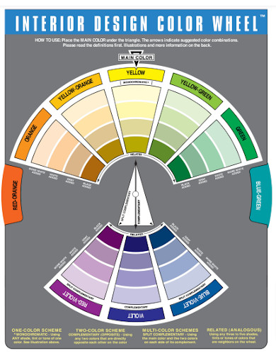
Interior Design Color Wheel
download now -
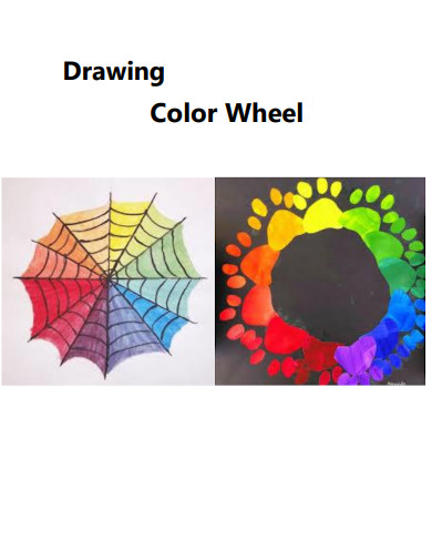
Drawing Color Wheel
download now -
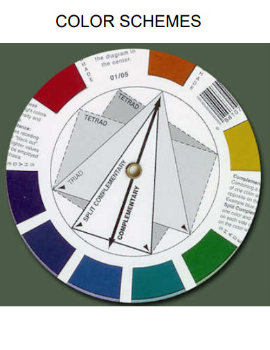
Schemes Color Wheel
download now -
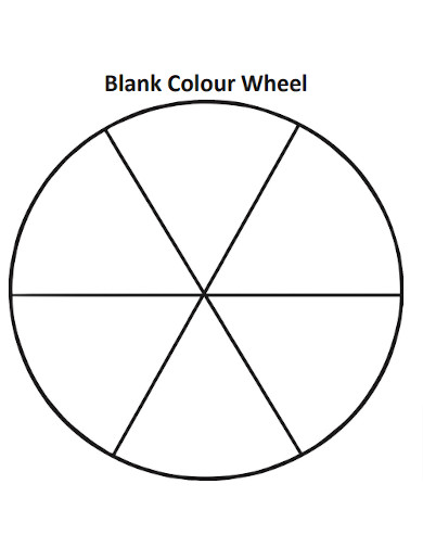
Blank Colour Wheel
download now -
Simple Color Wheel
download now -
Green Color Wheel
download now -
Design Color Wheel
download now -
Sample Color Wheels
download now -
Art Color Wheel
download now -
Printable Color Wheel
download now
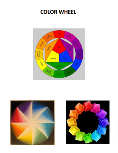
FREE Color Wheel s to Download
Color Wheel Names Chart
What is a Color Wheel?
Types of Color Wheels
Major Elements of Color Theory
How to Use a Sample Color Wheel
FAQs
What is a sample color wheel in PDF and Illustrator?
How can I use a sample color wheel to understand color theory?
Can I access a sample color wheel online?
How can a sample color wheel assist with selecting hair colors?
How do RGB and Hex color codes relate to a sample color wheel?
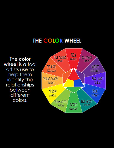
What is a Color Wheel?
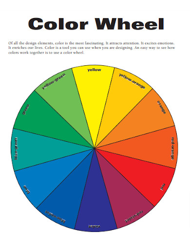
A color wheel is a visual representation of colors arranged in a circular format based on their relationship to one another. Its purpose is to provide a systematic and organized approach to color theory. The color wheel aids in understanding color relationships, such as complementary colors, analogous colors, primary colors, and split-complementary colors. By studying the color wheel, artists, designers, and other creative professionals can make informed decisions about color schemes that evoke specific emotions, create balance and contrast, and enhance visual impact. It is beneficial in fields such as graphic design, interior design, fashion design, and painting, being included in graphic design proposals, fashion design proposals, and interior design scope of work. With the emergence of digital platforms, the color wheel’s significance has expanded to include the representation of colors in RGB and Hex formats, influencing aspects like hair color and skin color in online creations.
The color wheel holds immense significance and effectiveness for artists, graphic designers, illustrators, interior designers, painters, and other creative professionals. Its visual representation of color relationships allows them to make informed decisions about color schemes that enhance their work. According to a study by Satyendra Singh, 62-90% of initial judgments about products are based on color alone. For artists, the color wheel aids in creating captivating compositions, evoking emotions, and expressing their artistic vision. Graphic designers and illustrators rely on the color wheel to establish brand identities, contrive specific moods, and enhance visual communication. Interior designers utilize it to create harmonious and aesthetically pleasing spaces. The color wheel serves as a reliable reference for these professionals, guiding their choices and ensuring effective color combinations that resonate with viewers and users alike.
Types of Color Wheels
In this section, we explore various types of color wheels, each designed to serve specific purposes and cater to diverse creative needs. From traditional color wheels to specialized ones for hair color and skin tone, discover the range of tools that empower artists, designers, and professionals in their color explorations.
Major Elements of Color Theory
This section delves into the fundamental elements of color theory, unveiling the building blocks that govern the world of color. From the color wheel and color harmony to value, saturation, contrast, and more, we explore the essential components that shape the understanding and application of color in art and design.
How to Use a Sample Color Wheel
In this section, we delve into the practicality of using a sample color wheel for various applications. Discover the step-by-step process that empowers artists, designers, and enthusiasts to unleash their creativity, select harmonious color schemes, and apply them effectively in diverse projects.
Step 1: Familiarize Yourself with the Color Wheel
Understand the different components of the color wheel, such as primary, secondary, and tertiary colors. Learn how they relate to each other and how to navigate the wheel to find complementary and analogous colors.
Step 2: Select a Color Scheme
Identify the purpose and mood of your application, whether it’s a graphic design project, interior design concept, or choosing a hair color. Use the color wheel to select a color scheme that aligns with your desired outcome, considering factors like complementary colors for visual impact or analogous colors for harmony.
Step 3: Experiment with Color Combinations
Use the color wheel to experiment with different combinations of hues, shades, and tones within your chosen color scheme. Explore variations in value and saturation to create depth and visual interest. Consider the RGB or Hex color codes for digital applications to ensure accurate color representation.
Step 4: Apply the Color Scheme
Apply your selected color scheme to your project or work. Use the chosen colors purposefully to create emphasis, establish hierarchy, or evoke specific emotions. Pay attention to how the colors interact with each other and with other design elements to achieve a visually pleasing and cohesive result. Regularly refer back to the color wheel for guidance and inspiration throughout the creative process.
FAQs
A sample color wheel in PDF and Illustrator is a digital representation of a color wheel, commonly used in design software or as a downloadable PDF like Adobe PDF. It serves as a visual reference for understanding color theory, showcasing primary, secondary, and tertiary colors, as well as complementary colors, to aid in creating harmonious color combinations.
A sample color wheel helps you grasp the principles of color theory by illustrating color relationships and providing a framework for selecting colors. You can explore complementary colors, which are opposite on the wheel, to create striking contrasts. Additionally, understanding primary colors and their mixtures allows you to comprehend color harmonies and create balanced compositions.
Yes, many online resources offer interactive sample color wheels that you can access and utilize directly on web browsers. These tools often provide additional features such as RGB and Hex color code representation, enabling you to experiment with colors and apply them to digital projects conveniently.
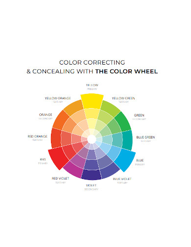
A sample color wheel can be invaluable for hairstylists and those considering a new hair color. It helps identify complementary or analogous colors to enhance natural features or create bold contrasts. By understanding color theory, you can select hair colors that flatter specific skin tones, creating a harmonious and aesthetically pleasing look.
RGB (Red, Green, Blue) and Hex (Hexadecimal) color codes are commonly associated with digital color representation. A sample color wheel often includes these codes for each color, allowing you to accurately replicate and apply specific colors in digital design or online applications. RGB and Hex color codes ensure consistency and precision when working with color palettes, including skin tones, hair colors, or any other digital representation of colors.
What is a sample color wheel in PDF and Illustrator?
How can I use a sample color wheel to understand color theory?
Can I access a sample color wheel online?
How can a sample color wheel assist with selecting hair colors?
How do RGB and Hex color codes relate to a sample color wheel?
Mastering the color wheel and its applications unlocks a world of creative possibilities. By understanding the purpose and use of this fundamental tool, artists, designers, and professionals harness the power of color theory. Exploring different types of color wheels, from traditional to specialized variations, expands the range of artistic expression. Grasping the major elements of color theory, such as harmony, value, and contrast, empowers the creation of captivating compositions. Following the steps in using a sample color wheel guides the selection and application of harmonious color schemes. With this knowledge, one can paint vibrant masterpieces, design visually stunning graphics, and evoke emotions through the mesmerizing language of color. Additionally, Sample.net provides eclectic well-crafted PDF design and document templates for arts, construction, design, and painting such as fabric samples, makeup samples, architectural design proposals, and many others that you may use.