19+ Sample Radar Charts
-
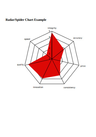
Radar and Spider Chart Example
download now -
Sample Radar Chart Template
download now -
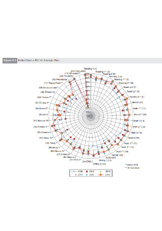
Radar Chart for Strategic Plan
download now -
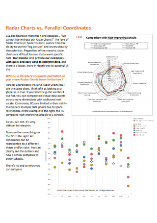
Coordinates Radar Charts
download now -
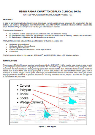
Radar Chart to Display Clinical Data Template
download now -
Radar Summary Chart Template
download now -
Basic Radar Chart Template
download now -
Standard Radar Charts
download now -
Evaluation of Cardiac Markers Radar Chart
download now -
Software Radar Charts
download now -
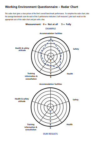
Working Environment Radar Chart
download now -
Radar Instrument Charts Template
download now -
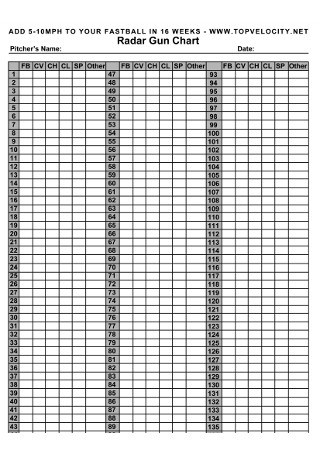
Radar Gun Chart
download now -
Simple Radar Char
download now -
Radar Material Chart Example
download now -
Radar Graphs and Chart
download now -
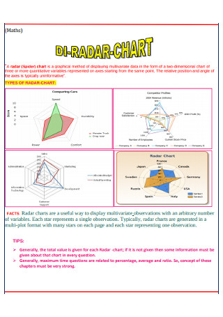
Sample Di-Radar Chart Template
download now -
Printable Radar Graphs Template
download now -
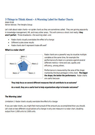
Warning Label for Radar Charts
download now -
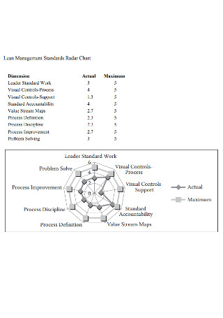
Standard Lean Management Radar Chart
download now -
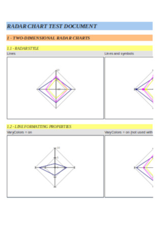
Rader Chart Test Document Template
download now
FREE Radar Chart s to Download
19+ Sample Radar Charts
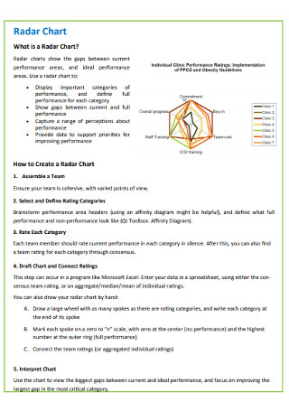
What is a Radar Chart?
Uses of Radar Charts
Alternative Charts and Graphs to a Radar Chart
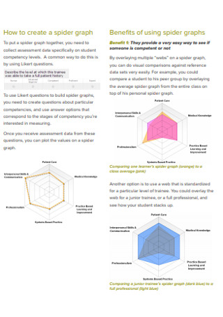
How to Create a Radar Chart
FAQs
What are the benefits of using a radar chart?
What are some effective uses of a radar chart?
What are the different types of radar charts?
How to customize and use a radar chart?
How to read a radar chart?
What is a Radar Chart?
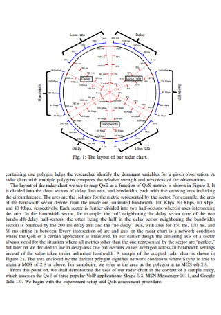
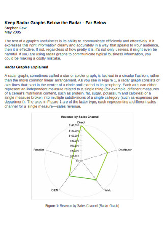
A radar chart is a data visualization tool that aids the viewers to analyze and be informed on the multivariate data presented in a two-dimensional chart of three or more quantitative variables. Also known as a spider chart, Kiviat diagram, polar chart, star plot, or web chart, it is used for data analysis to communicate and visualize research findings as it demonstrates vivid and visual description, realizes dynamic analysis, scientifically depicts the industrial development track, masters comprehensive data effectively for the relevant department, and easily applies and promotes to make the assessment concise and intuitive in order to encourage people to pursue excellence and progress.
Each variable is given an axis that begins from the center point. While maintaining the sample scale between all axes, all axes are arranged radially with equal distances between each other. Grid lines connecting from axis to axis are made as a guide. Each variable value is plotted with an individual axis, making all the variables in a data set linked to create a polygon. Thus, using a radar chart is beneficial to present data outliers and commonalities in a striking manner.
Uses of Radar Charts
Product designers, software developers, HR managers, marketing specialists, educators, professors, and other professionals use radar charts and other types of charts such as sample comparison charts and pie charts for a wide array of purposes. Understand the different purposes and uses of radar charts in different fields and industries.
Alternative Charts and Graphs to a Radar Chart
Although radar charts are great to use when comparing multiple sets of data or changes that take place over time, these charts have limited uses in data analysis when it comes to making trade-off decisions and when dealing with large data. Here are some common alternative charts and graphs to a radar chart that you can use if you need to use other data visualization tools for your work.
How to Create a Radar Chart
Radar charts have some advantages such as having easily noticeable outliers and allowing the comparison of unrelated variables. Follow the four steps in this section for creating a comprehensive, simple yet well-structured radar chart.
Step 1: Collect Data Set and Axes
Assemble the team who will conduct data analysis using a radar chart. Decide the rating categories and criteria with your team members. Then, specify the variables and their values for different entities for the comparative analysis. Draw a table to have all the data ready for your radar chart.
Step 2: Use a Radar Chart Template in Your Preferred Format
Search for some sample downloadable and editable radar chart templates online. Sample.net provides a diverse collection of chart and graph templates such as Pareto chart templates and radar chart templates that you can conveniently and quickly use for your comparative data analysis project or employee work productivity analysis work. Choose from our chart template collection and download your preferred radar chart template in PDF or Excel format.
Step 3: Edit or Format the Radar Chart
Once you opened the radar chart template, incorporate all types of vectors into your charts and represent your data properly. Depict the information while working on all the axes of the radar chart. Modify the entire appearance of the radar chart if you like.
Step 4: Save and Export the Radar Chart or Create a Radar Chart in Excel
When you are done editing your radar chart, save and export the chart. If you want to create a radar chart in Excel, choose the data range you need to present in the radar chart and choose the options in Excel by clicking Insert, then Other Charts, and selecting Radar. Choose the type of radar chart you want (simple radar chart, radar chart with markers, or filled radar chart). Edit the colors and labels if you like and save your file.
FAQs
Some of the benefits of using a radar chart are it is easy to read, it can be compared to different data sets quickly, it displays a lot of data points, it can be used when comparing proportions or averages, and it is a fantastic data visualization tool to showcase changes over time.
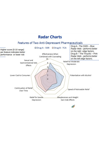
A radar chart is used when comparing the properties of a single component or comparing the properties of two or more variables together. It can be helpful in comparing an individual’s performance to that of a group and can be used by the human resource department to analyze different employee groups and examine their work performance and productivity. One example of the effective use of a radar chart is when comparing two anti-depressant drugs on features like efficacy for severe depression, the prevalence of side effects, continuation or relief over time, and cost to the customer,
The different types of radar charts commonly used are basic radar chart, radar chart with markers, and filled radar chart.
Open a spreadsheet in Google Sheets and double-click the chart you want to customize. Click customize and select an option to chart style. Then, change how the chart looks to radar. Show the range gridlines. Edit or format the chart and axis titles.
After plotting a value along each axis and connecting up the resulting points that forms a polygon, identify what category each axis represents and assess how the categories are related to one another while reading around the wheel of the chart.
What are the benefits of using a radar chart?
What are some effective uses of a radar chart?
What are the different types of radar charts?
How to customize and use a radar chart?
How to read a radar chart?
If you are planning to illustrate the comparison of data groups and entities with unique characteristics or personalities, create and use radar charts so that you can easily compare the items with different parameters. Rader charts are essential data visualization tools to support competitive analysis, consumer product choice analysis, employee productivity review, and many other uses. If you are having a difficult time in making a radar chart, our website provides an eclectic collection of sample radar charts, diagrams, graphs, infographics, and other graphic representation documents for your work such as control charts, firm organization charts, and tap and drill charts.