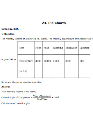
44+ Sample Pie Charts
-
Construction Pie Chart
download now -
Judgment Error in Pie Chart
download now -
Pies Chart for Dessert
download now -
Sample Pie Charts
download now -
Formal Pie Chart
download now -
Communication-Effective Pie Charts
download now -
Two Pie Chart
download now -
Pie Chart Format
download now -
Cost of Pie Chart
download now -
Reading Pie Chart
download now -
Simple Pie Chart
download now -
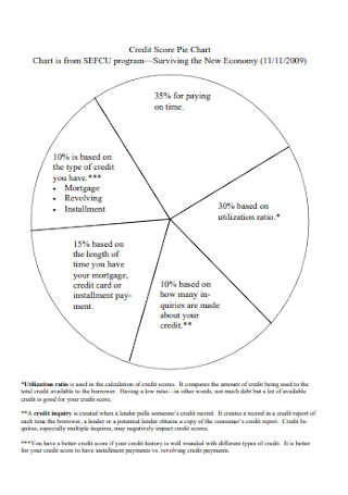
Credit Score Pie Chart
download now -
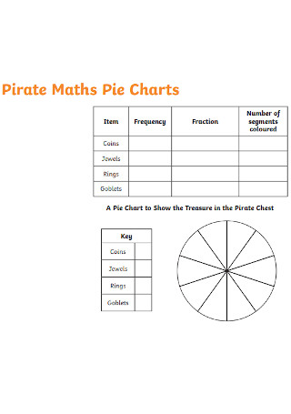
Pirate Maths Pie Chart
download now -
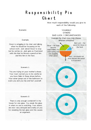
Responsibility Pie Chart
download now -
Venn Diagram and Pie Charts
download now -
Easy as Pie Charts
download now -
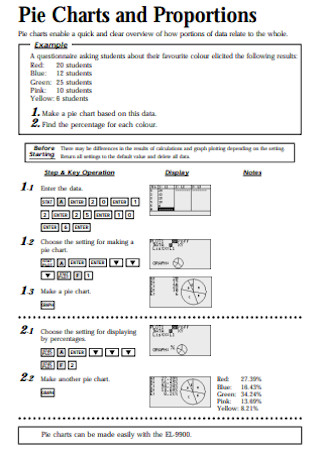
Pie Charts and Proportions
download now -
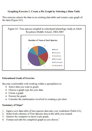
Pie Graph and Chart
download now -
Expressive Pie Chart
download now -
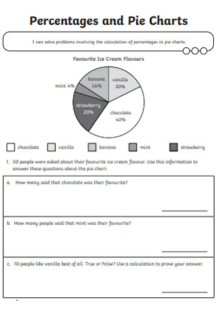
Percentages and Pie Charts
download now -
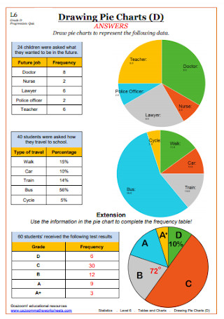
Drawing Pie Charts
download now -
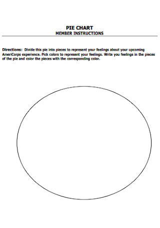
Motivational Pie Chart Worksheet
download now -
Sales Pie Chart
download now -
Draw Pie Charts
download now -
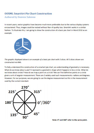
SmartArt Pie Chart Construction
download now -
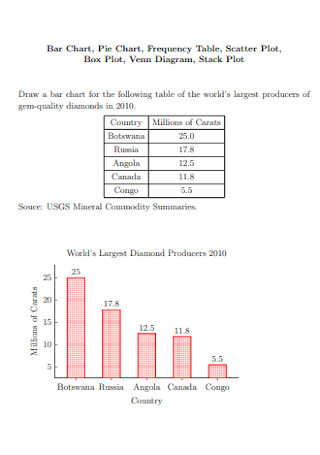
Bar Chart and Pie Chart
download now -
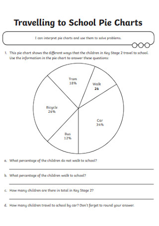
Traveling to School Pie Chart
download now -
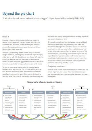
Beyond the Pie Chart
download now -
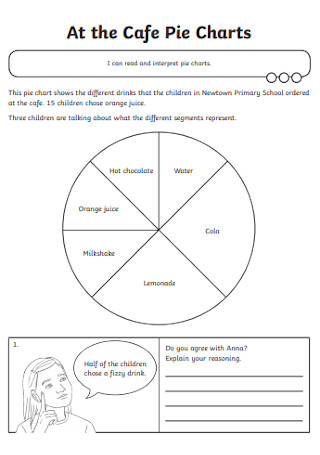
Cafe Pie Chart
download now -
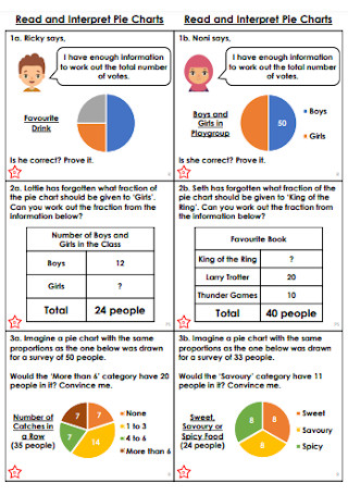
Read and Interpret Pie Chart
download now -
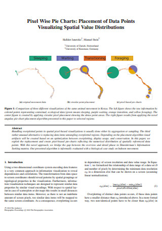
Pixel Wise Pie Chart
download now -
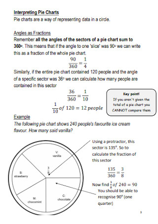
Interpreting Pie Charts
download now -
Pie Chart and Bar Chart
download now -
Graphic Presentation Pie Chart
download now -
Making a Pie Chart
download now -
Sample Presentation in Pie Chart
download now -
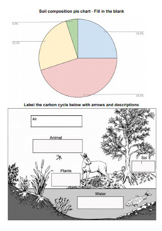
Soil Composition Pie Chart
download now -
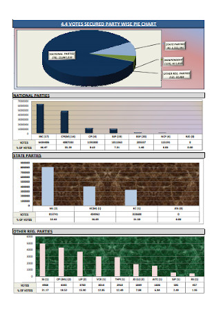
Party Wise Pie Chart
download now -
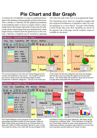
Pie Chart and Bar Graph
download now -
Standard Pie Chart Template
download now -
Whole Pie Chart
download now -
Pie Charts and Pictographer
download now -
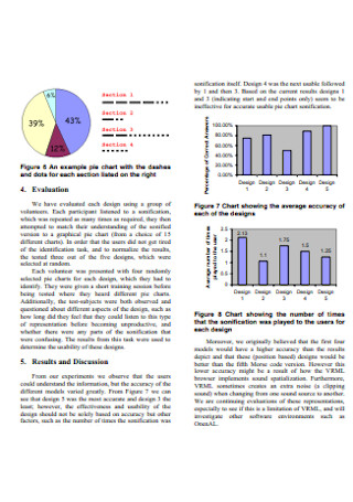
Pie Chart Sonification
download now -
Interpreting Pie Chart
download now
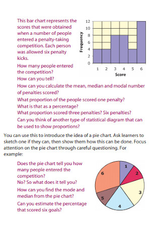
What Is a Pie Chart?
A pie chart is a chart that is used to visually present data according to a given statistics. Its shape is round that looks like a pie and is also where its name comes from. Pie charts also have sections or slices that are divided and each of their sizes differs depending on their value. Pie charts are known to break down a category into groups or sections that make them a whole. It is often used to present data about the population, food, or budget of a certain topic.
Most businesses use a lot of graphs and charts, especially the pie chart. According to Statista, there were 804,398 that were less than 1 year old in March 2020 and over 1.53 million businesses that were more than 26 years old in the United States. Regardless of age, most of them surely used numerous charts and graphs.
What Are the Types of Pie Charts?
Aside from a classic pie chart, there are also various types of pie charts, and most of them you can find in the templates showcased above. These few examples are a few of the useful types of pie charts that you can use in certain cases.
How to Create a Pie Chart?
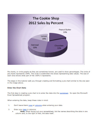
Creating a pie chart is not as easy as you think. It involves entering data into the spreadsheet to create the chart. Be aware that there might be also complicated things that you might encounter when making one especially when starting from blank, so here is a step-by-step guide for you on how to create a pie chart.
Step 1: Choose a Design
The first thing you need to do is to have your data ready as well as your editing tools. You can choose to download a ready-made template for a head start or start from scratch using an editing software application that can also create charts such as Microsoft Excel. Choosing the design is your next step. There are various designs you can choose from so make sure to pick the right one that suits your purpose. Check our ready-made templates above for more ideas.
Step 2: Insert Data
Data is needed to complete the chart. In the editing software application, there is a spreadsheet that appears as you soon click the chart you choose. Afterward, replace the data in the spreadsheet with your own. Close the spreadsheet as long as you are done. Make sure to check if the chart is divided accordingly. If errors are found, return to the spreadsheet immediately and edit until everything is good to go. Make sure to label each of them accordingly.
Step 3: Include Details
Pie charts alone are not enough to complete the information. Include the details such as an introduction and a conclusion. Include other charts as well when it is necessary. Bar charts are also one of the most common charts used in presenting data and a comparison to the changes over time. Pie charts are only known to present the data of each section or group under a certain category.
Step 4: Recheck and Edit
Recheck your work if there are any errors or misinformation. If it does, then go back and edit immediately. Include some colors. Adding colors to your chart can make it more interesting and effective in understanding the data more easily. Only choose the colors that are suitable for each slice. As soon as you are done with everything, print it out in the number of copies depending on how many individuals you are going to give. You can also send it via email or fax depending on your preference.
Advantages and Disadvantages of a Pie Chart
Pie charts don’t really work on everything and there are advantages and disadvantages when making a pie chart. The advantages are that pie charts are simple and they are easy to understand. The audience can see the data comparison easier at one glance and able to understand information to make an analysis immediately. It also requires minimal additional details as the chart can give you concise visual illustrations.
On the other hand, the disadvantages are that they can be less effective if too many pieces of data are used. Additionally, they can also be crowded and difficult to understand. It also does not show the exact values straightforwardly. If you have data that shows a relative change in time, a pie chart is not the best pick. This is the time which you will need to use other types of charts or graphs. We also provide you a list of some of the other charts below.
What Are the Other Types of Charts?
There are other types of charts and graphs aside from pie charts. Most of these can be found in Microsoft Office software applications such as Microsoft Word and Excel. Over 650,000 companies in the United States have used Office 365 in 2020, according to Statista, and therefore, lots of users already used any of these types of charts. Check it out and learn the uses of different types of charts. Here are a few examples of the most common and useful charts that you can use in particular cases.
1. Bar Charts
A bar graph or chart is one of the most common charts or graphs that presents categorical data in rectangular bars. The bars can be oriented vertically or horizontally. Each bars’ height or length is automatically adjusted according to the value or data that they represent. It is sometimes called a column chart. It is also often used as a comparison between things from different groups or records of changes over time. This type of chart is effective when you have data that can be divided into different categories or groups.
2. Line Charts
Another common type of chart that displays lines that represents the comparison between changes over time. This type of chart is called Line charts. It is a continuous line that connects the dots to highlight changes over short or long periods of time. It is often used in finance. Line charts are likely similar to the bar charts, however, in most cases, line charts are better to use when it displays smaller changes in a trend over time. On the other hand, bar graphs are useful in comparing larger changes in data among groups.
3. Radar Charts
A radar chart, sometimes known as a Spider chart, is an informative visual chart or graph that displays a comparison between multiple variables in a two-dimensional plane. It is often used as a comparison chart of two or more items on multiple characteristics. This is effective when comparing two products to easily determine which one has better features. Radar charts look like a spider web that each corner represents a feature or characteristic. The radius of each point adjusts according to the value that they represented.
4. Funnel Charts
A funnel chart looks like a funnel shape and helps you visualize a linear process. It is often used to represent different stages in a sales process and it also shows different values for each stage. It can also be effectively used on showing the contributions of each individual in your team. Other uses include analyzing the success of a promotional campaign, evaluating the recruitment process, and analyzing and managing order fulfillment cycles.
5. Gantt Charts
The Gantt Chart is often used in scheduling and planning projects. It is a graphical representation of a project schedule that shows the start and finish dates of tasks or activities of the project. It also divides each individual on each task. Gantt chart was named after the name of its creator, Henry Gantt. According to ProofHub, Gantt charts are also effective in improving communication and cohesion for the team, and in fact, 86% of employees feel a lack of communication which has been the biggest reason for workplace failures. Gantt charts have been proved to provide clear communication which can also help project managers know who is working on the task and pass relevant information to them.
6. Combo Charts
Combo Chart is a chart that represents multiple sets of data in various ways on the same chart. As mentioned in its name, it is a combination of many kinds of data into a single chart. An example of this is a bar graph combined with a line graph in the same chart to show actual values in columns with a line together that shows a goal or target value. You may also display columns, lines, areas, and steps all on the same chart or any of them mixed. It visually highlights the differences between various sets of data.
FAQs
What is a pie chart used for?
A pie chart is best used if you have categorical data as each slice can represent a category. One example is statistics where it shows the different percentages of the population using a certain product from different places.
Why are pie charts bad?
They are one of the most overused graphs in the world and most of them are not the best way to present data. They make it more difficult for decision-makers to understand the information they contain as they often distort the information.
Can you make a pie chart in Google Docs?
Yes, google docs have a pie chart available for you to add to your document. You can find it in the insert menu. Select the type of pie chart that you want to add to your document. Then enter the data in the spreadsheet that appeared after selecting the chart. The pie will adjust and arrange automatically and accordingly.
In conclusion, many businesses still use pie charts to present data analysis for their target market and income. Some of them use it together with the other types of charts and graphs for a better and clear presentation. If you are running a business, the pie chart might save your business from going down. We also offer you ready-made templates for other charts and graphs such as bar charts, Gantt charts, Flow Charts, and many more.