20+ Sample Bar Chart Templates
-
Segmented Bar Chart
download now -
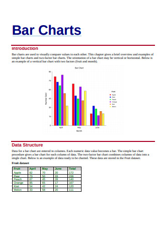
Bar Chart Example
download now -
Floating Bar Chart
download now -
Pie Chart and Bar Chart
download now -
Bar Chart Format
download now -
Bar Graph Sample
download now -
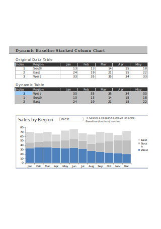
Dynamic Stacked Column Chart
download now -
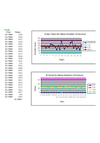
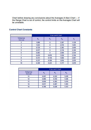
X-Bar and R Chart
download now -
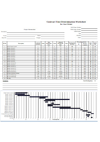
Bar Chart Method
download now -
Sample Bar Chart in Excel
download now -
X Bar S Chart
download now -
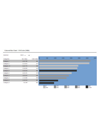
Colored Bar Chart
download now -
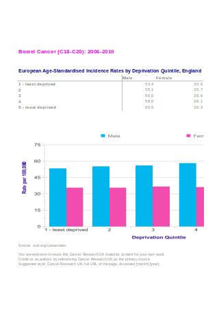
Deprivation Bar Chart
download now -
Sample Bar Charts
download now -
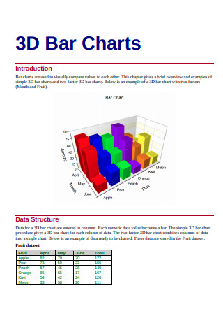
3D Bar Chart
download now -
Bar Chart Template
download now -
Standard Bar Chart
download now -
Format of Bar Chart
download now -
Compound Bar Chart
download now -
X-Bar and R Control Chart
download now -
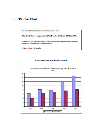
IELTS – Bar Chart
download now -
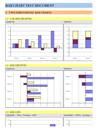
Bar Chart Test Document Template
download now
What is a Bar Chart?
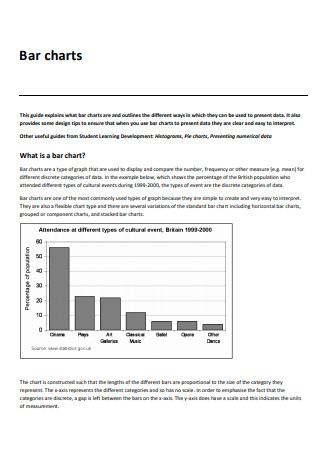
Bar charts are a common data visualization tool for comparisons and data analysis. They let users group information into different categories that appear as a series of bars. Each bar corresponds to the value indicated by the vertical and horizontal axes. One axis shows the discrete value of each bar while the other axis shows the categories used. To distinguish one group from the other, you can designate colors for different bars. A higher value typically corresponds to a taller or longer bar. In other versions of the diagram, the length and position of the bars indicate time or progress. Bar charts allow for easier and faster interpretation of data than just looking at the numbers. Like any tool, the graph’s usefulness depends on whether you are using the right equipment for the job.
Types of Bar Charts
A simple bar chart consists of two or more bars that stand on the horizontal axis. For example, you want to report the number of male and female students in a classroom. Unless you will make a point about the difference, you can just write the description. What if you are comparing the number of male and female students in seven different classrooms? Instead of writing down a lengthy paragraph describing the results of your survey, you can illustrate the results in a bar graph. You would have 14 bars, two for each classroom. But data doesn’t always come as straightforward as in the given example. That is why there are different types of bar charts for different occasions.
Graphical Chart Family
Depending on the data you have and the information you want to put out there, you have a variety of data presentation tools to choose from. Through simple and symbolic graphics, you can illustrate facts into figures.
Histogram
You can say that bar charts and histograms are fraternal twins. They look the same, but they are not necessarily identical. While bar charts categorize data into groups for comparison, histograms show continuous data. Both can be read similarly but each communicates different types of data. Histograms deal with ranges. The range can be the ages 0 to 5, 6 to 10, and 11 to 15. Since the data are continuous, there is no space between the bars. Histograms show the amount and frequency distribution of data across different groups.
Line Graph
A line graph is a series of data points connected by a line. It shows the progression of values over time. You can use line graphs to show the increase or decrease in the sale of a product over the year. Line graphs or charts indicate the trend of the values. When you have compiled enough data, you can see a pattern in the sales of merchandise. With that, you can predict and brace for a projected decrease in productivity in your business.
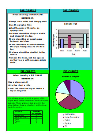
Pie Chart
When you want to illustrate the parts of a whole, you can use a pie chart. Unlike a stacked bar chart, you only need one data category for pie charts. It is useful when you want to find out how much each element contributes to the bigger picture. For example, you want to know where your company’s profit goes to. You can use the chart to show the percentage of each expense compared to the total amount. For pie charts, you will use different colors to indicate the different parts. Since there is no axis to gauge the value of each part, you should label each chunk with its percentage.
Scatter Plot
A scatter plot is a type of graph that use the Cartesian coordinate plane to show the pattern and relationship between two sets of data. Each point is plotted based on the horizontal and vertical axes. The data groups can be divided based on the proximity of the set of points with the other.
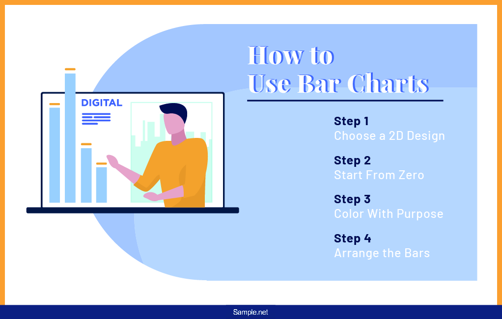
How to Use Bar Charts
The phrase “To see is to believe” is incomplete. It is a matter of what you see that influences whether you would believe it or not. For instance, someone tells you that the business sales plummets during May, June, and September but increases during February and December. Between a spreadsheet of these numerical data and its graphical representation, you would be quicker to believe the latter. It is easier to communicate the facts to an audience when the people see the facts clearly for themselves. But effective visual communication through graphs isn’t as simple as plotting values on the x and y axes. It is common for people to misuse graphs and misrepresent the information in the process. How will you avoid committing the same blunders?
Step 1: Choose a 2D Design
A bar graph is not the best place to showcase your creativity. It may go against the purpose of the bar chart, which is to make reading the information easy. Although you have this option in Excel and other data visualization tools, avoid using three-dimensional bars for aesthetics. The tip of the bar should match the value of the data group. Three-dimensional bars make it harder to match the tip to its value on the horizontal or vertical axis. You will do yourself and your audience a favor when you stick to the simple rectangle. Steer from customizations that make reading the graph harder.
Step 2: Start From Zero
When you are making your graph, see to it that your values begin at zero. It helps the readers get a grasp of the values. For instance, you may be comparing the levels of alcohol dependence across different age ranges. Starting from a non-zero baseline would make it seem that a range is handling their alcohol significantly well than others, even if that is not the case. The graph would misrepresent the data and mislead the readers. If the values start from a high number, you can use logarithmic and other scales for the chart. However, you should always declare the scale you used.
Step 3: Color With Purpose
While we love fun and colors, we wouldn’t appreciate it when we are analyzing a graph longer than we should have to. Including all the colors of the rainbow in your graph is a faux pas of using graphs and charts. When you are using five or more colors in your graph, the bar chart you are using may not be right. You can break apart the graph into simpler charts. If the color has no purpose, don’t use it. For instance, you are comparing your company’s sales with the sales of eight other competitors. Only your company should have a distinct color while the rest have uniform colors. You may also highlight your closest rival with a different color.
Step 4: Arrange the Bars
Instead of having your bars look like a city skyline, it is good practice to arrange them in a certain order. You can do so from the tallest or longest to the shortest. When we use this in the example given earlier, it will be easier to see where your company stands among the competition. However, things will be different when you are plotting the monthly sales of the company. Do not alter the arrangement of the bars when they are supposed to be in that order. When the categories are within the same group, like that they are the sales of your company alone, you can use a trend line to show the pattern.
FAQs
Can bar charts be skewed?
No, bar charts do not display skewness of data. For example, in a vertical bar graph, the horizontal axis does not stand for numerical values. Instead, it shows the categories of the data. Unlike histograms, there is no high or low end in bar charts that will show the data distribution.
When does a bar chart become misleading?
A bar chart becomes misleading when the labels and scales aren’t properly indicated, and the baseline isn’t zero. The chart should report the values correctly. It should have the appropriate labels. It should contain information such as sample size, time of the survey, and other details involved in creating the graph that when removed could influence its credibility.
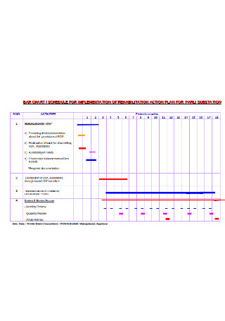
What is project management bar chart?
Gantt charts are a kind of bar charts that shows progress over time. These graphs show the schedule and duration of tasks. Gantt charts are useful in project management to monitor the progress of the project.
How is bar chart different from waterfall chart?
A waterfall chart is a kind of bar chart. It has the same attributes that make a bar chart, but it has a more specialized function. Waterfall charts show how the value of something increases or decreases.
Without presentation, data would remain a collection of numbers. And people would have to spend due time on them to understand what they mean in the scenarios involving them. Bar charts and other graphical representations make way for us to understand at a glance what the data represents. Because the potential of data is in how it is presented, it is often easy to mislead people with the tweaked figures. Truth reporting is a responsibility that comes with the perks of charts and diagrams.