28+ Sample Comparison Charts
-
Comparison Chart Format
download now -
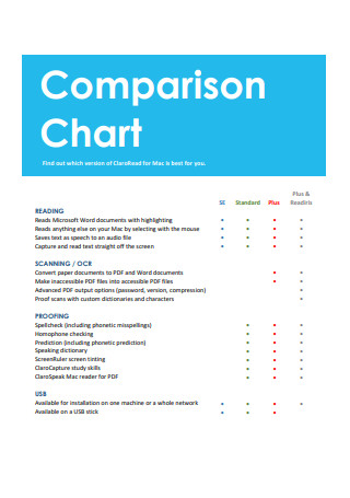
Sample Comparison Chart
download now -
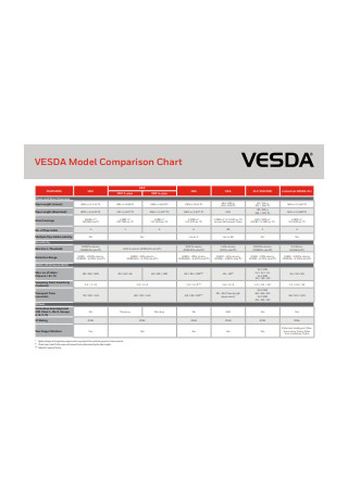
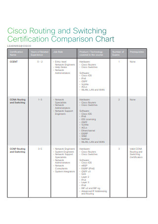
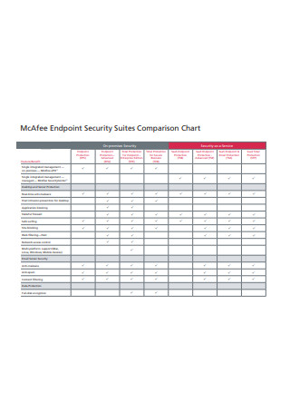
Model Comparison Chart
download now -
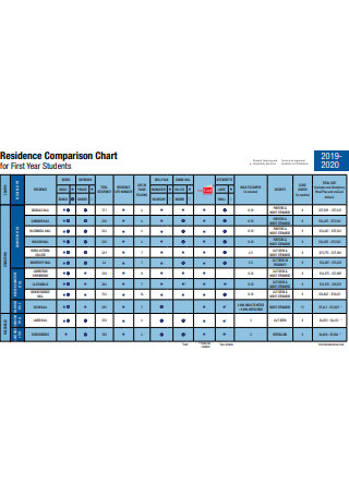
Residence Comparison Chart
download now -
Comparison Chart Example
download now -
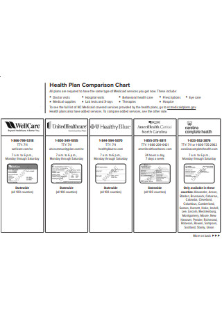
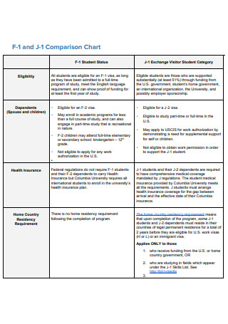
Health Plan Comparison Chart
download now -
Sample Comparison Chart Format
download now -
Comparison Chart Sample
download now -
Formal Comparison Chart
download now -
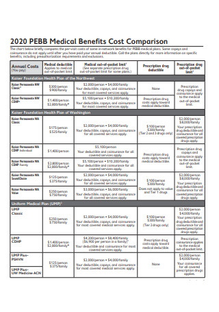
Medical Benefits Cost Comparison Chart
download now -
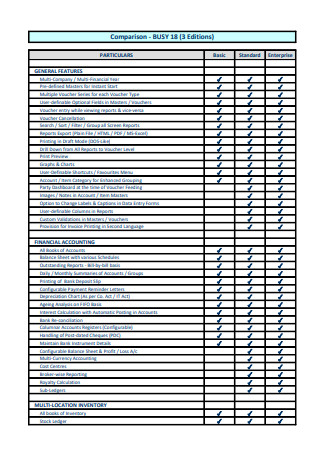
Basic Comparison Chart
download now -
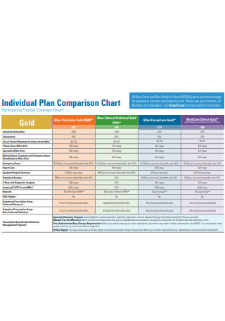
Individual Plan Comparison Chart
download now -
Standard Comparison Chart
download now -
Formal Comparison Chart Example
download now -
Decibel Level Comparison Chart
download now -
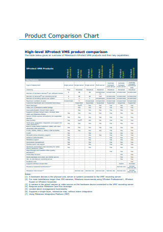
Product Comparison Chart
download now -
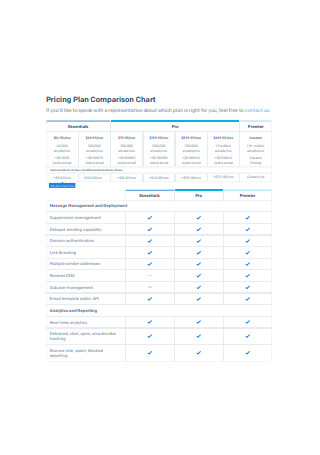
Pricing Plan Comparison Chart
download now -
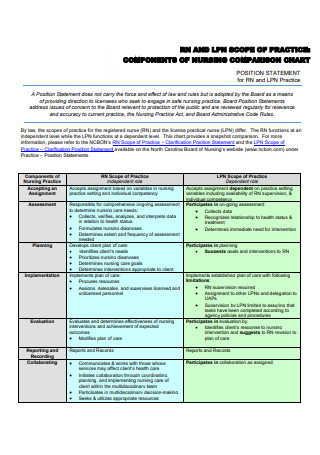
Nursing Comparison Chart
download now -
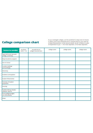
College comparison chart
download now -
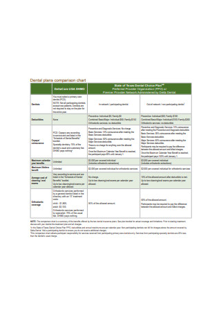
Dental plans comparison chart
download now -
Basic Comparison Chart Example
download now -
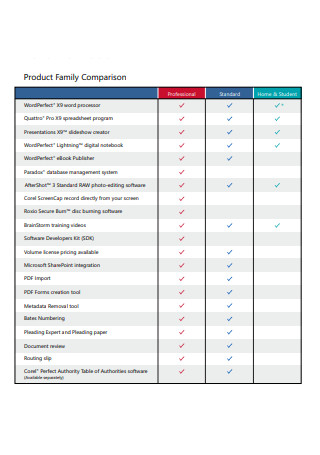
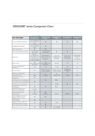
Product Family Comparison Chart
download now -
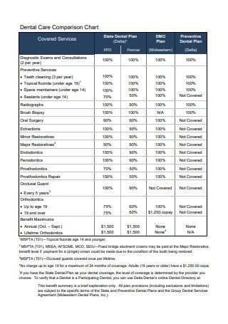
Dental Care Comparison Chart
download now -
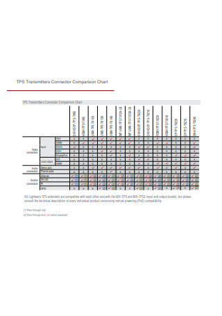
Transmitters Connector Comparison Chart
download now -
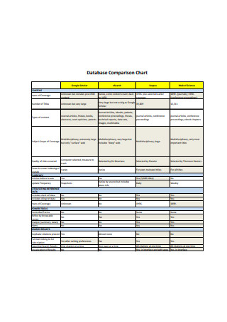
Database Comparison Chart
download now -
Product Comparison Chart Sample
download now -
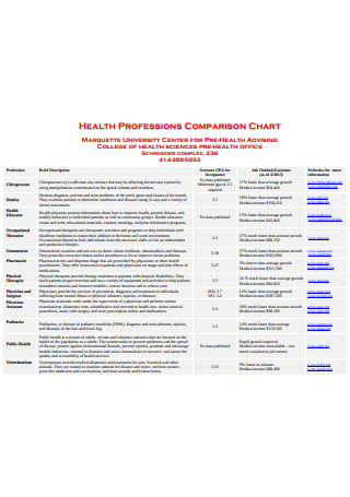
Health Professions Comparison Chart
download now -
Comparison Chart Report Template
download now -
Comparison Annual Chart Report Template
download now
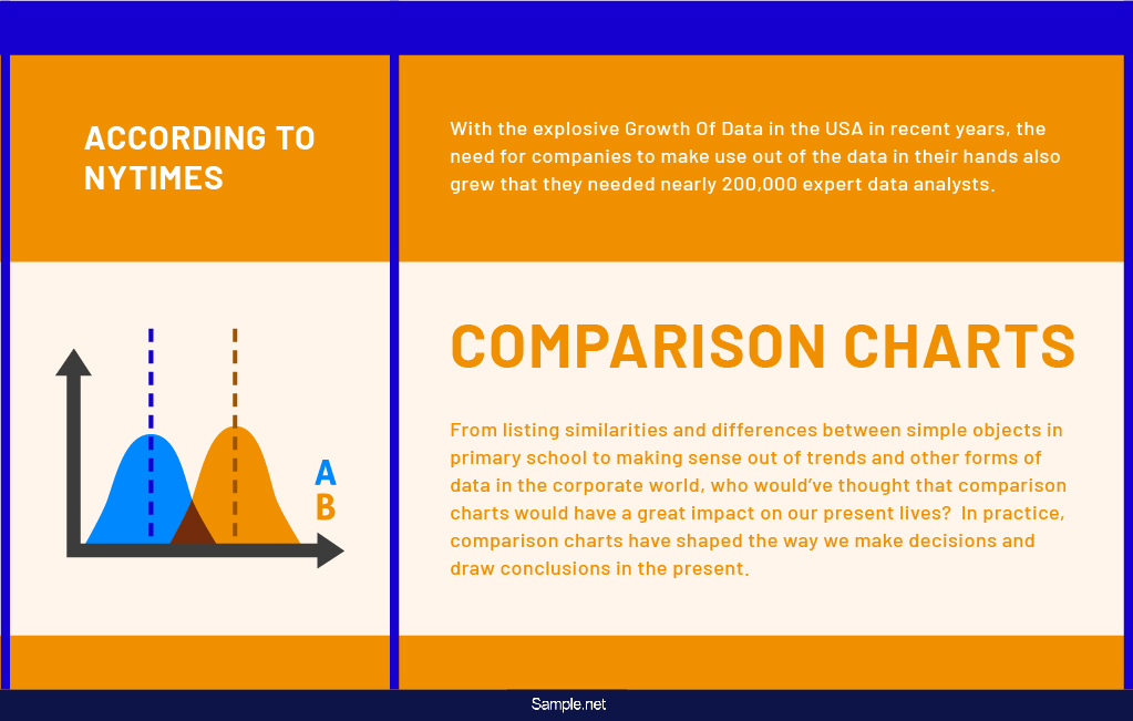
Academic and Business Uses for Comparison Charts
From listing similarities and differences between simple objects in primary school to making sense out of trends and other forms of data in the corporate world, who would’ve thought that comparison charts would have a great impact on our present lives? In practice, comparison charts have shaped the way we make decisions and draw conclusions in the present.
Comparison Charts in the Academic Setting
In the academic setting, comparison charts are already taught to children as early as primary school. Comparison charts are taught in school as the basic way of making out the similarities and differences of two or more ideas or things. It simply started from making use of charts in comparing their ideas and comparing the characters they read in storybooks to making comparisons in science experiments and drawing out wise decisions when involved in school event organizations. As early as kindergarten, young minds are already trained to analyze the similarities and differences of the features or attributes of various things. In school, children are taught that making comparisons is an essential skill that can not only help them further in their studies but can also help them in their personal lives, and soon when they will start building their career trajectory.
Comparison Charts in the Business Setting
Comparison charts are widely used in businesses as one of the ways to keep track of their performance and determine whether there are things that need improvement or not. If you are tasked to conduct a market study and the like, you can encapsulate and present your findings in a chart so your managers and clients can effectively comprehend what you present. No matter how excellent your results were, it will be of no use if it is presented unfavorably and will be perceived poorly by your audience. Comparison charts are also useful if you provide products to your customers. You can use comparison charts upon differentiating the features of your products (feature comparison), and determining what features that makes each product different from the others (feature comparison), comparing prices of various products (cost comparison), and upon giving your customers a clear and comprehensive view of the benefits that people can get from your products.
Types of Charts Used for Comparing
With the continuous existence of big data, it brought about various types of charts that are used in managing various types of data. Among those types are charts that are mainly used for comparing items. Some of these types are briefly discussed below.
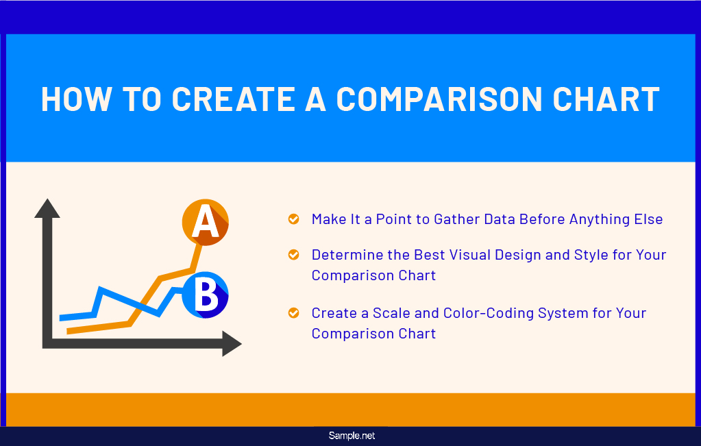
How to Create a Comparison Chart
Comparison charts are a summary of numerical data presented visually to help people make comparisons better and quicker. Even if there countless times when we were given the task of creating comparison charts before, you can still find yourself asking or browsing the web for the steps on how to create a comparison chart as if it’s still your first time doing so. That said, we provide you with some guidelines and tips that can help you retain the basic things you need to remember upon making a comparison chart.
Make It a Point to Gather Data Before Anything Else
Before you gather data and compare them against each other, ensure that you have already conducted thorough gathering data that enables you to obtain various useful data that will make fair comparisons and make a visual presentation that displays facts that are real and valid. When you gather data first, you can easily compare it within specific and similar standards. It gets confusing for the part of your audience if you don’t have enough data to use.
Determine the Best Visual Design and Style for Your Comparison Chart
As you have seen and read above, there various types of charts. In fact, listed above are just some of the basic and commonly used ones. Of all the types of charts that can be used in comparing, choose the best one that is suitable for the kind of data that you have and in what way you are planning to present it to your audience. If you want to present trends over a time series, then use line charts. If you’re going to analyze two entities out of a statistical finding, a bar graph is what you should opt for.
Create a Scale and Color-Coding System for Your Comparison Chart
For your audience to thoroughly understand what you are trying to present in your comparison chart, it is crucial to always come up with a specific scale in your comparison chart. Without this element, it will be difficult for you to infer vital data into your graph. Apart from the scale, it is also highly relevant to incorporate a color-coding system in your comparison chart to make every single variable unique from the other categories within your comparison chart. You can start by having a different color for each bar that represents a year in your bar chart. With color-coding, reading your comparison chart will be a breeze for you and your audience.
Advantages and Disadvantages of Comparison Charts
As listed above, comparison charts quite a lot of uses in the major aspects of our lives. But along with its usability are its advantages and disadvantages. That is why before you come up with a comparison chart, ensure that you have some ideas as to what it can and cannot do for you. That said, take notes of some of the following advantages and disadvantages of comparison charts discussed below that you should take consideration before starting to create what could be your first comparison chart.
A lot can be demonstrated using charts, and if you want to attract the attention of your audience while not compromising its comprehensibility, the use of charts can take you a long way. For human beings, a picture is worth a thousand words, especially that most of them are visual learners. And because of this, human brains can easily make sense of complex sets of data through data visualization. Luckily for us, data visualization tools like comparison charts came about and made groundbreaking changes in how to take in various groups of data. Should you want to get a headstart upon making a comparison, consider downloading any of the comparison chart templates and examples made available for convenient and quick download. These comparison chart samples are made to ensure that the charts you are creative can effectively sort out the differences and similarities of any object or data in your hands.