15+ Sample Graph Analysis Templates
-
Statistical for Streaming Graph Analysis
download now -
Graph Network Model and Analysis
download now -
Motif-Driven Graph Analysis
download now -
Building Blocks for Graph Analysis Template
download now -
High Performance Graph Analysis
download now -
Simple Graph Analysis Template
download now -

Dynamic Graph Analysis Template
download now -
Map-Based Graph Analysis
download now -
Graph Analysis of Word Networks
download now -
Simple Graphical Analysis Template
download now -
Graph Based Statistical Analysis
download now -
Approaches to Graph Analysis
download now -

Augmented Visibility Graph Analysis
download now -
Graph Analysis of Student
download now -
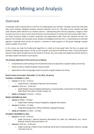
Graph Mining and Analysis
download now -
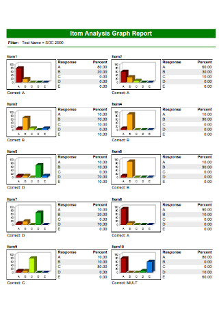
Item Analysis Graph Report
download now
FREE Graph Analysis s to Download
15+ Sample Graph Analysis Templates
What Is Graph Analysis?
What Are the Types of Graphs?
How to Conduct Graph Analysis
FAQs
What are other names for a graph analysis?
What are the two axes of a graph?
What is a graph database?
What are the main parts of a graph?
How do you write an analysis in general?
What Is Graph Analysis?
Let us go back to what a graph is first. A graph refers to a visual representation that contains points and lines, also called vertices and edges. Graphs basically let users form the model data to define relationships, check the flow, and other examples that require analytics. Meanwhile, graph analysis is the systematic process of analyzing a graph’s data until you can come up with conclusions, interpretations, and recommendations from what such graphs convey. And that analysis is crucial to many examples of data-driven content.
According to a survey, there were about 7.8 million full-time researchers in 2013.
Meanwhile, the US Bureau of Labor Statistics (BLS) reported that the number of jobs for financial analysts in 2019 reached up to 487,800.
Why Is Graph Analysis Important?
It is known that graphs and charts are important visual data representations in the form of bar graphs, pie charts, line graphs, etc. And graph analysis is just as important to dig further in understanding your data. Maybe graphs can measure the accuracy of an experiment, earned value, or sales. But why do you think the measurements reached such answers? And what caused such conclusions? Those are further explained by graph analysis.
Also, graph analysis is heavily practiced by researchers out there. In 2013, the United Nations Educational, Scientific, and Cultural Organization (UNESCO) said that there were around 7.8 million full-time researchers. Imagine how many have also analyzed their data with charts and graphs. More so, graph analysis is not limited to researchers alone. It can be practiced through physics, math, competitor analysis, and so much more. One example is a financial analyst. In 2019, financial analysts even garnered up to 487,800 jobs. Expect to welcome more applications of graph analysis.
What Are the Types of Graphs?
In order to process a graph analysis, it is crucial that you are introduced to the different types of graphs first. That way, you can identify each type of graph and know the appropriate steps or analysis measures to conduct afterward. Bear in mind that how you manage graph analysis is not a one-solution-for-all process; different procedures apply. So without further ado, here are the types of graphs:
How to Conduct Graph Analysis
You already know about a graph analysis’s meaning, importance, and types. Now, be ready to apply what you learned by knowing how to conduct the analysis itself. Rest assured, it can be an easy process since you were already introduced to the key points earlier. And what is even better? We have laid out to you the six basic steps on how a graph analysis is done. Just follow these steps:
Step 1: Perform a Data Analysis
It is crucial to perform data analysis first because that process enables you to understand what to study or how to work on your graph’s data. Data analysis lets you know what data to gather and investigate such information. This form of analysis lets you extract information and create decisions from the results. And you should also read the graph’s previous data so you will not take its details out of context. Maybe every problem statement, questionnaire, hypothesis, and other relevant data not found in the graph can help you analyze the graph easily. After data analysis, you can proceed to work on the graph.
Step 2: Use a Graph Analysis Template
Have you seen our list of graph analysis templates above already? If not yet, take your time in checking each sample. You can slowly decide which template suits best to your graph analysis later on. Also, you need not settle on how a template is because all our sample templates have editable features. You are free to personalize the format, style, design, and other content inside. The best part is you do not start making one from the very beginning. Premade templates are fillable. So there are initial parts done for you already. Your only concern is the finishing details.
Step 3: Read the Graph’s Title
It is standard that when you analyze graphs, there are graphs to use as your basis. First things first, check the title of the graph. Its title automatically gives you an idea about what information it conveys. An example is when you get involved with sales, particularly in checking the number of toy dolls sold in December. Hence, the title can go for ‘Number of Toy Dolls Sold in December.’ As much as possible, use the right graphs to analyze or your whole answer will be doomed already.
Step 4: Find the Key
You will likely be concerned about the answer key. That key usually is enclosed in a box among graphs. It shows the symbols, colors, legends used in the graph; thus, explaining what every factor means. Without an answer key, you might confuse what certain symbols in a graph signify. For example, a black circle found in a graph may refer to one brand of an item. Yet, you assumed it refers to the number of items sold. That misunderstanding will surely lead to incorrect conclusions in the long run. Also, such keys must be easy to understand so it will not confuse analysts.
Step 5: Understand the Graph’s Labels
To boost your understanding of a graph, understand the graph’s labels. Indeed, the previous step teaches you to identify what each label or variable means. But in graph analysis, you do more than just identifying; you analyze what they mean. Take a bar graph, for example. If one bar reached its highest peak, what does that mean? Does it display that there are more sales during that time? If yes, what was the reason behind that huge increase? Those are some questions that will be answered as you slowly analyze graphs.
Step 6: Make Conclusions from the Data
And for the tough final part, draw conclusions. Do not simply create random conclusions because you will base them on the data you collected. Data tables or descriptions often help too. When you are done concluding, you will eventually create closing statements. This part is where you summarize everything, including the data results. The same goes for feedback, recommendations, and plans for a better application next time. And ensure that whoever reads your analysis can understand as well. Once you are confident of the final output, launch it.
FAQs
What are other names for a graph analysis?
Graph analysis has many names, including graph analytics and graph algorithms. Although they have slight differences in meaning and spelling, they are still reliable analytic tools to understand the direction or relationship among variables in a graph. And without them, it can be challenging to analyze graphs properly.
What are the two axes of a graph?
A graph contains two axes—the x-axis and the y-axis. They are represented as two lines. The horizontal line refers to the x-axis while the vertical line represents the y-axis. In most cases, the x-axis represents specific numbers or categories. Meanwhile, the y-axis consists mostly of numerical data.
What is a graph database?
The graph database refers to a special program that ultimately formulates and controls graphs. And those graphs would have the nodes, edges, and other properties to help present or store data that other databases could not achieve. This database also goes hand in hand with graph analytics for an in-depth and more detailed understanding regarding graphs, charts, and the like.
What are the main parts of a graph?
There are different types of graphs but generally, there are about six main parts of a standard graph. And they consist of the following:
- Title – gives the summary and introductory statement of what your graph is.
- Source – explains where the data in the graph are found.
- X-axis – is a horizontal line that represents one variable.
- Y-axis – is a vertical line that represents another variable.
- Data – refers to the entire data or information found in the graph.
- Legend – tells you what each symbol, label, or element in a graph represents.
How do you write an analysis in general?
An analysis can be written in an essay or formal writing pattern. Just remember to fully explain the topic’s meaning. You can answer the who, what, where, when, why, and how as your guide. Also, analyzing discourages bias. Thus, prevent giving opinions. You may compare the topic from other analyses and you end with an evaluation of your whole analysis.
Graphs and graph analyses continue to evolve, especially with bigger data, more advanced solutions, and newer challenges. But one thing is clear, graphs still remain a useful standard tool to analyze data. And it is essential that you know how graphs work, how to analyze them to gather insights, and how to create solutions that contribute to your needs and future successes. That can happen, starting with a quick download from our sample graph analysis templates.