20+ Sample Pareto Charts
-
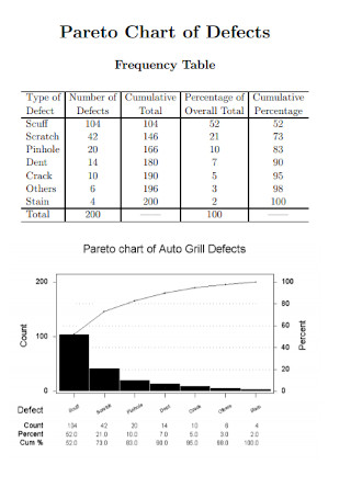
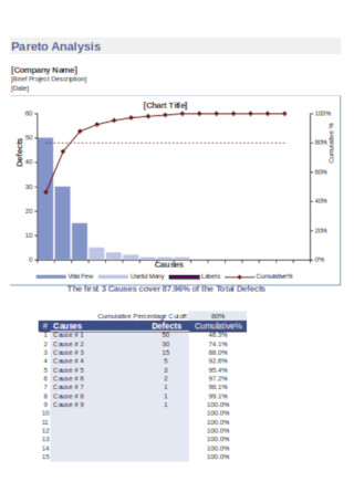
Pareto Chart of Defects
download now -
Sample Pareto Chart Template
download now -
Pareto Chart Versus Sensitivity Analysis
download now -
Revising the Pareto Chart
download now -
Basic Pareto Chart Template
download now -
Pareto Analysis Chart Template
download now -
Distribution Pareto Charts
download now -
Simple Pareto Chart Template
download now -
Health Pareto Chart Template
download now -
Statistical Tests for Comparing Pareto Charts
download now -
Standard Pareto Chart Template
download now -
Pareto Chart After Implementation Template
download now -
Pareto Chart Format
download now -
Printable Pareto Chart Template
download now -
Teacher Education by Pareto Chart
download now -
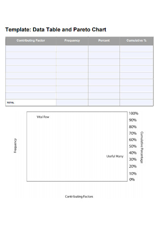
Data Table and Pareto Chart
download now -
Sample Pareto Chart Example
download now -
Statistical Software Pareto Charts
download now -
Science Pareto Chart Template
download now -
Pareto Charts and Basic Measurement Template
download now -
Printable Pareto Chart Template
download now
FREE Pareto Chart s to Download
20+ Sample Pareto Charts
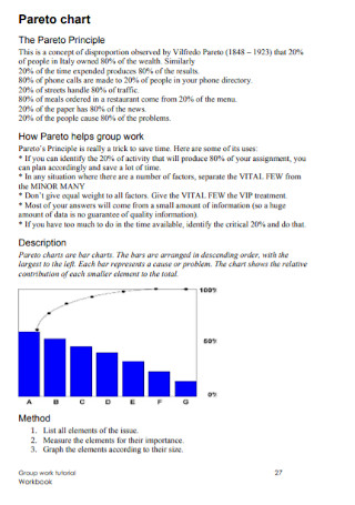
What is a Pareto Chart?
Uses of Pareto Charts
Alternative Charts and Graphs to a Pareto Chart
How to Create a Pareto Chart
FAQs
What are the benefits of using the Pareto principle?
What is the 80/20 rule in the Pareto chart?
What is the main objective of a Pareto chart?
What are Pareto charts in Excel?
How to interpret a Pareto chart?
What is a Pareto Chart?
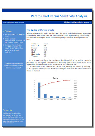
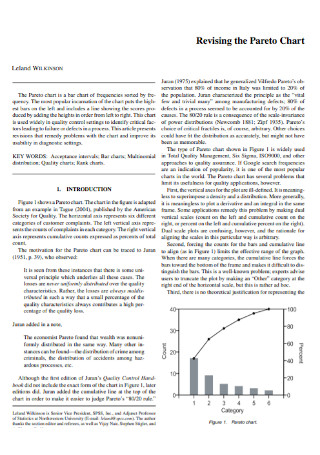
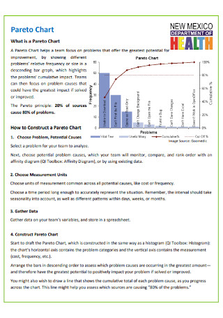
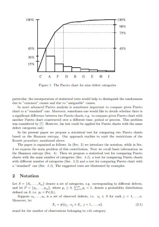
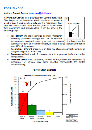
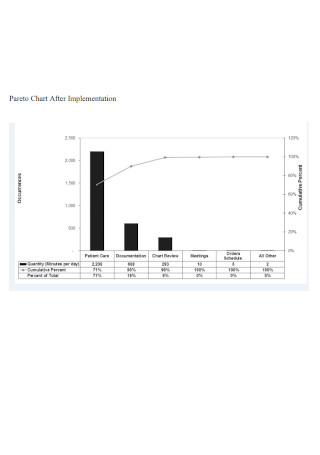
A Pareto chart is a hybrid of a bar chart and a line graph used for data analysis of various issues, problems, or causes by cost, time, or frequency of occurrence and for determining the most significant or critical issues in a business, an organization, a society, or an industry. Also known as a sorted histogram chart, a Pareto chart is composed of both columns sorted in descending order and a line representing the total cumulative percentage. It points out the largest elements or factors in a data set and guides project managers, quality control managers, and other professionals to observe and examine the most common issues.
According to Asana, the Pareto principle or the 80-20 rule “is a phenomenon that states that about 80% of outcomes derive from 20% of causes.” Pareto charts demonstrate the relationships between two numbers, their quantities, their changes, and their relationship to other quantities. For instance, when production and quality managers are assessing a product’s quality, the Pareto chart displays the number of occurrences for a specific type of failure and the percentage that each type of failure has among all occurrences of failure. Using a Pareto chart can help them and other managers to identify which most frequently occurring failure(s) to resolve first, improve output, and determine the feasibility of a business idea.
Uses of Pareto Charts
Production managers, product analysts, software developers, quality control managers, sales marketing specialists, and other professionals use Pareto charts and other types of statistical representations such as pie charts for a variety of purposes. Learn more about the different purposes and uses of Pareto charts in different fields and industries.
Alternative Charts and Graphs to a Pareto Chart
Aside from a Pareto chart, there are some basic quality control and project management tools that you can use when it comes to identifying and resolving business or organizational problems.
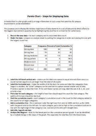
How to Create a Pareto Chart
Pareto charts are easy to create when you use software and apps like Excel, MS Word, and PDF. Follow the steps indicated in this section for making a simple and systematic Pareto chart.
Step 1: Identify and Divide the Causes or Issues
Specify the causal factors or issues you want to represent on the Pareto chart. These factors could be positive or negative based on the context of an event or situation. Divide the causes or issues into specific categories. Select the correct measurement (frequency, cost, or quantity) and define the time period for the chart.
Step 2: Construct a Frequency Table and Plot the Bar Chart
Construct a frequency table to document the occurrence of different variables at different points in time. Include a cumulative frequency column in your frequency table. Use the collected data to compute the subtotals for each category. Then, adjust the scale of your left vertical axis to account for the biggest subtotal from the different categories. Draw your bars progressively from the tallest on the left to the shortest on the right.
Step 3: Make a Computation and Draw the Line Graph
Compute the percentage of each subtotal category when you divide them by the total of all categories that represent 100% as shown by the right vertical axis. After that, compute the cumulative sums from left to right and draw the line graph to represent the sums against the percentage of the right vertical axis.
Step 4: Use a Sample Pareto Chart Template
To easily and quickly create a Pareto chart, select, download, and use a sample Pareto chart template available online. Sample.net offers wide-ranging chart and document templates including Pareto charts. Edit the content and style of the template according to your needs and preferences. Finalize and save the Pareto chart after including all the important data points.
FAQs
Using the Pareto principle in business can help in increasing productivity and profits. Identifying that 80% of sales are generated by 20% of the sales and marketing associates demonstrates where you need to prioritize your attention and resources.
The 80/20 rule in the Pareto chart states that approximately 80% of the effects come from 20% of the causes for most events.
The main objective of a Pareto chart is to portray the relative frequency or size of different issues in a descending bar graph in order to point out the cumulative impact of the issues or problems.
Pareto charts in Excel highlight the largest factors in a data set. These charts are project management and quality control tools to help managers and teams to analyze the most common issues or problems.
When you interpret a Pareto chart, know each major component included in the chart. The left vertical axis contains the number of counts or amount of cost depending on the data used.
What are the benefits of using the Pareto principle?
What is the 80/20 rule in the Pareto chart?
What is the main objective of a Pareto chart?
What are Pareto charts in Excel?
How to interpret a Pareto chart?
Project managers, quality control managers, product designers, and other professionals use Pareto charts for eclectic applications such as customer support, finance, marketing, sales, project management, and quality control. These charts are beneficial to identify the most significant causes or challenges a company or an organization encounters and to convey data effectively to others. If you need to create other types of charts for your project, our website provides a unique collection of sample charts, diagrams, graphs, and other documents such as sample root cause analysis, radar charts, and waterfall charts.