Waterfall Chart Templates
-
Waterfall Chart Templates
download now -
Building a Waterfall Chart
download now -
Waterfall Chart in Power Template
download now -
Bridge Waterfall Chart Template
download now -
Sample Waterfall Bridge Chart
download now -
Simple Waterfall Chart Template
download now -
Basic Waterfall Chart Template
download now -
Standard Waterfall Chart Template
download now -
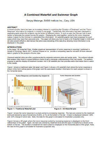
Waterfall and Swimmer Graph Chart
download now -

Waterfall Reveals Chart Template
download now -
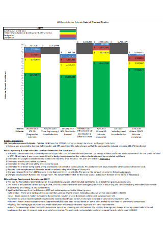
Aquatic Center Estimate Waterfall Chart
download now -
Bars with Waterfall Charts
download now -
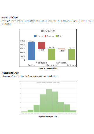
Waterfall Histogram Chart
download now -
Formal Waterfall Charts
download now -
Project Waterfall Chart Template
download now -
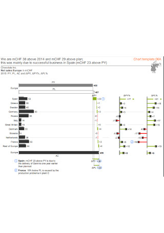
Waterfall Strategic Long-term Planning Chart
download now -
Bullet Charts and Charting Templates
download now -
Waterfall Bar Chart Template
download now -

Formal Waterfall Chart Template
download now -
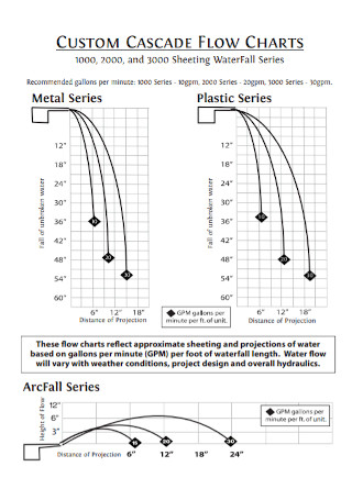
Waterfall Custom Flow Chart
download now -
Sample Waterfall Chart Template
download now -
Waterfall Bridge Chart Template
download now
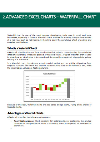
What is a Waterfall Chart?
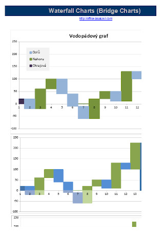
A waterfall chart is a type of bar chart used in demonstrating the progression toward a cumulative result while indicating how positive or negative components or values contribute to the total. Also known as a bridge chart, a flying brick chart, or the Mario chart specifically in finance, it is used in project management plans in a corporate setting for displaying how specific segments are contributing to one’s end goals and/or the overall result. Compared to a simple bar graph or line chart, a waterfall chart allows you to showcase the complexity of the data and uncover some hidden points in your cumulative numbers.
It distributes all of the varying components that contributed to that net change and visualizes them one at a time. From the name itself, this chart looks like a waterfall or a staircase moving up and down. The first bar starts from the zero baseline of the x-axis which displays the initial quantity of a particular measure. Next, there is a series of bars with different heights, seemingly floating in space as they often rise to a peak and then fall down towards the baseline. After that, these floating bars lead up to one final bar that displays the ending quantity.
Uses of Waterfall Charts
Financial analysts, insurance agents, economic analysts, investment analysts, human resources (HR) managers, and other professionals working in finance, insurance, and HR sectors use the waterfall chart for different purposes. Understand the different purposes and uses of the waterfall charts in different fields and industries.
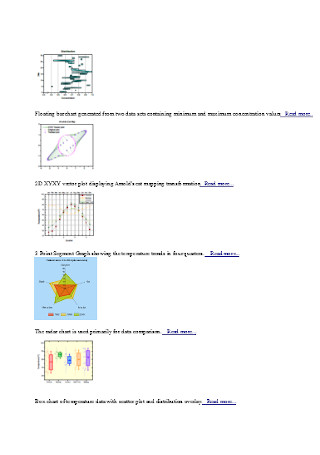
Alternative Charts and Graphs to a Waterfall Chart
Aside from using waterfall charts for visualizing your projects, financial statements, and other tasks, you can use different types of charts, diagrams, and graphs for your data analysis and documentation plan. Here are some alternative charts and graphs to a waterfall chart that you can use if you need to use other graphical representation tools for your work.
How to Create a Waterfall Chart
Although the rise of technology and the increased access and proficiency in word processing applications, Excel spreadsheets, and data presentation software has allowed us to collect and analyze greater amounts of data, there are still many people who are having difficulties in telling stories with numbers using charts, diagrams, charts, tables, and many other graphical representations. Follow the four steps in this section for creating a modern and sleek waterfall chart.
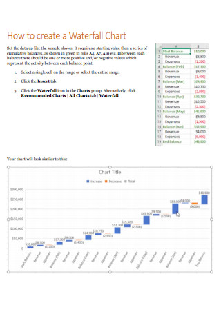
Step 1: Use a Waterfall Chart Template in Your Preferred Format
Search for some sample downloadable and editable waterfall chart templates around the internet. Sample.net contains a diverse collection of chart and graph templates such as Gantt chart templates and waterfall chart templates that you can easily and quickly use for your data analysis work. Select from our chart template collection and download your preferred waterfall template in Excel, MS Word, or PDF format.
Step 2: Format the Waterfall Chart Template
If you are using Excel, open the chosen waterfall chart template and edit the categories, labels, and data points. In the default Excel waterfall chart, you will see red and blue columns, demonstrating the increases (blue) and decreases (red), plus a generic title. Make any formatting changes to the chart as you change the text in the chart title. Format a Total column by clicking it to select the entire data series, clicking on it again to select the column, right-clicking on the Total column, and clicking the Set as Total command in the pop-up menu. Then, you will notice a green fill color in the Total column.
Step 3: Edit the Chart Style
The next step is to edit the chart style of your waterfall chart template. If you don’t like to keep the default chart style with numbers displayed on each column, you can choose and apply one of the other built-in styles available in Excel and other formats. To change the chart style, click and select the chart, click the Paintbrush button located in Chart Styles at the right side of the chart, scroll through the list of chart styles, and click on a style you want to apply to your chart.
Step 4: Customize More and Save Your Waterfall Chart
If you want to change the colors of the different types of values in your waterfall chart, you can customize it to maximize the clarity and impact of the chart details. On the Design tab, open the Change Colors gallery to change the color of your chart. Select a color scheme that is automatically filled with themes that are perfect for your document. After customizing, check your entire chart if you miss any important category, label, or value, and save your file.
FAQs
A waterfall analysis is a data visualization and data analysis tool that guides investors and shareholders in creating financial models of the total amount each shareholder would obtain after the exit of the business firm. These financial models go through in-depth calculations to enable users to observe potential exit scenarios.
Waterfall charts are essential graphical representation tools to visualize change from a starting to an end value and to illustrate the positive and negative data points. These charts are simple to understand, provide micro-stories, visualize profit and loss statements, compare product earnings highlight budget changes on a project, analyze inventory or sales over a period of time, create executive dashboards, show attrition and growth in hiring, and many other purposes.
Waterfall charts can be used for wide-ranging types of quantitative data analysis such as inventory analysis, cash flow analysis, performance analysis, financial analysis, market trends analysis, project budget analysis, and many others.
What is a waterfall analysis?
Why do we use waterfall charts?
Are waterfall charts quantitative charts?
If you need to visualize change and growth in your sales and marketing, share industry statistics using an infographic, compare product earnings and highlight product value over time or depict the positive and negative contributions of your projects in your department with a waterfall chart, think carefully as you plan and execute all the fundamental points aforementioned in this article when you prepare your waterfall chart. Be skilled in visualizing data and telling stories with it so that you can turn it into vital information that can be utilized to facilitate better decision-making. Additionally, we offer an extensive collection of sample waterfall charts, diagrams, graphs, infographics, tables, and other visual representation documents for your work such as a graph paper PDF, and control charts.